PRoject Overview
For this project, I created a full brand identity based on an animal of my choice. The process included developing a visual identity, selecting a color palette, designing a logo, and establishing typographic guidelines. I then compiled all of these elements into a comprehensive brand guidelines document, demonstrating how the brand could be applied consistently across various materials and touchpoints.
Process
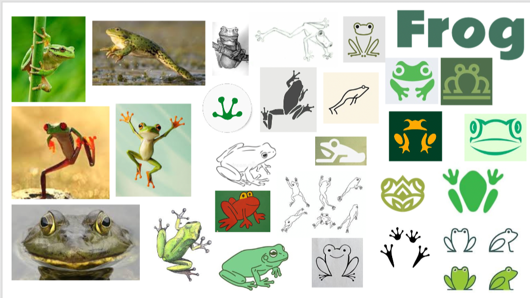
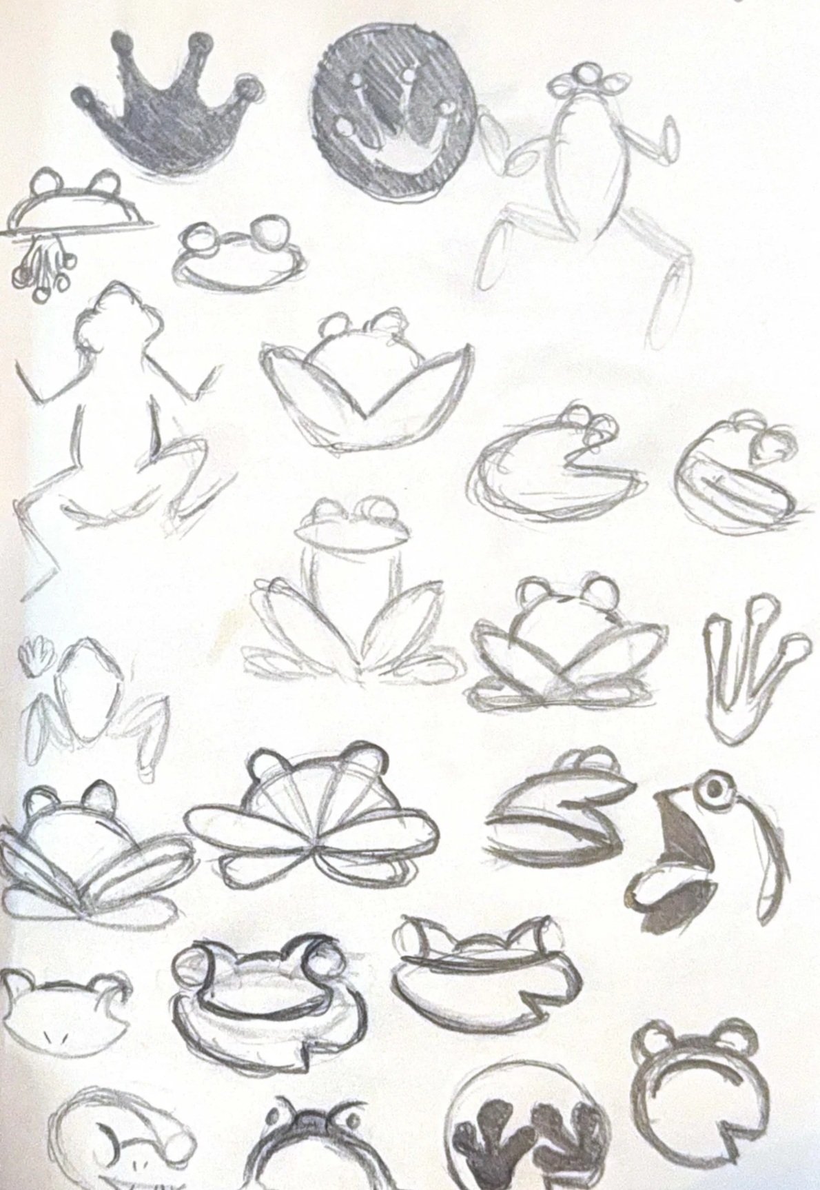
For this project, I started by exploring how to represent a frog in a visually interesting and abstract way, focusing on capturing both its static form and sense of movement. I gathered inspiration from a variety of references, including photographs, illustrations, and existing graphics, to experiment with different approaches and shapes.
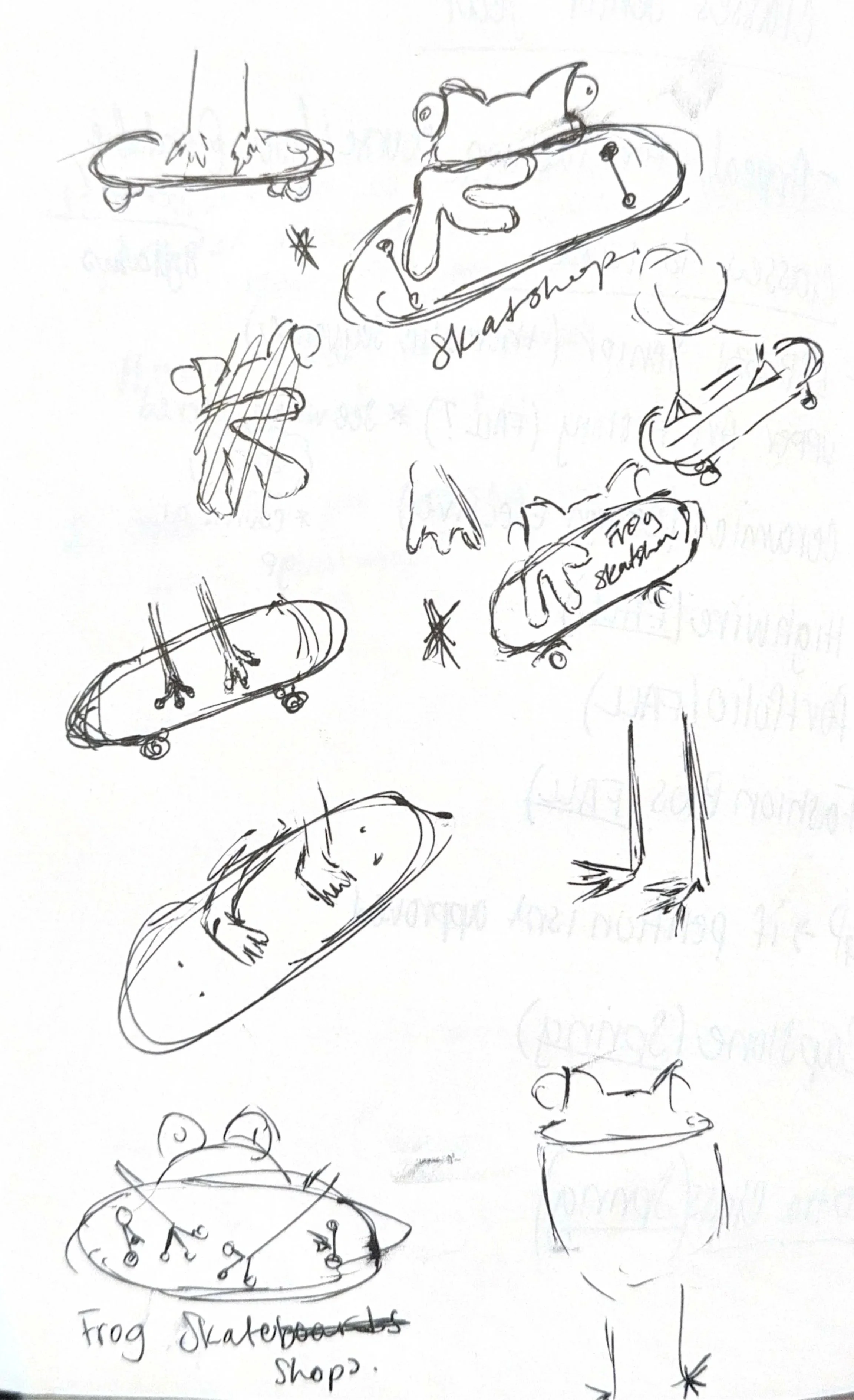
I decided to frame the brand as a fashion-oriented skateshop, which led me to consider how to incorporate skateboarding elements into the identity. This informed early sketches and iterations, where I tested ways to combine the frog motif with skateboards and other playful, dynamic elements.
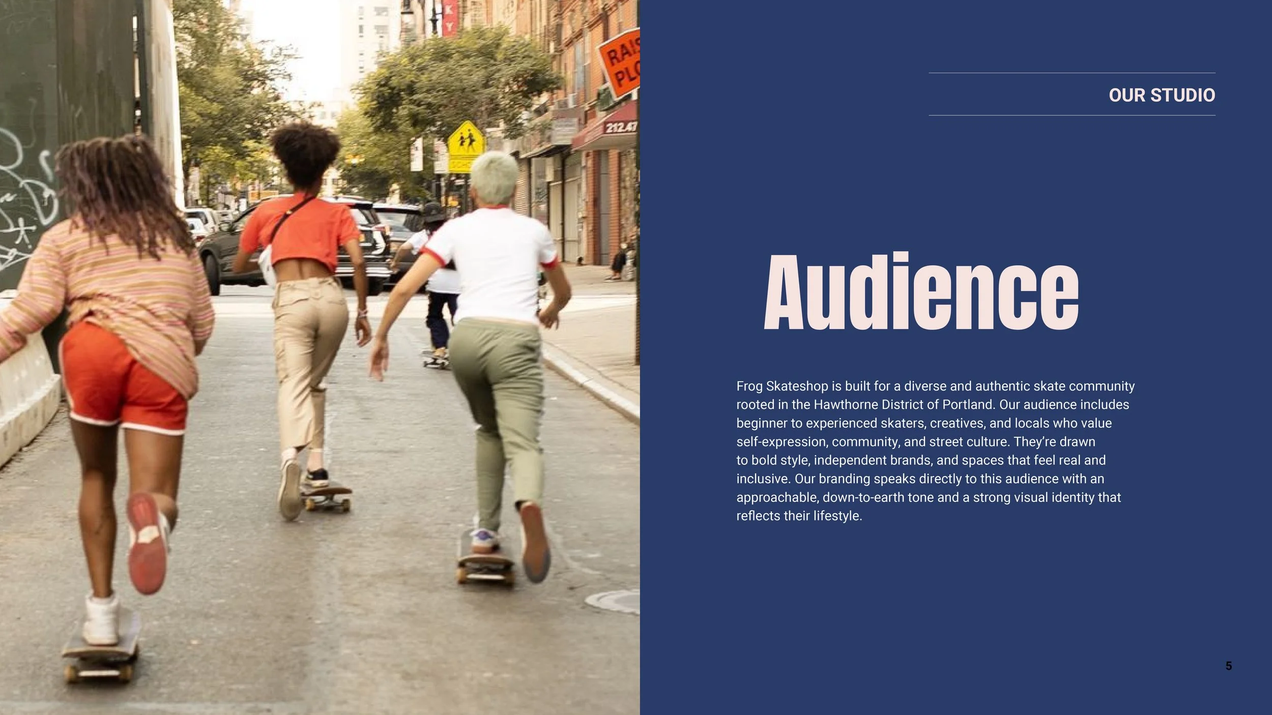
Logo Iterations


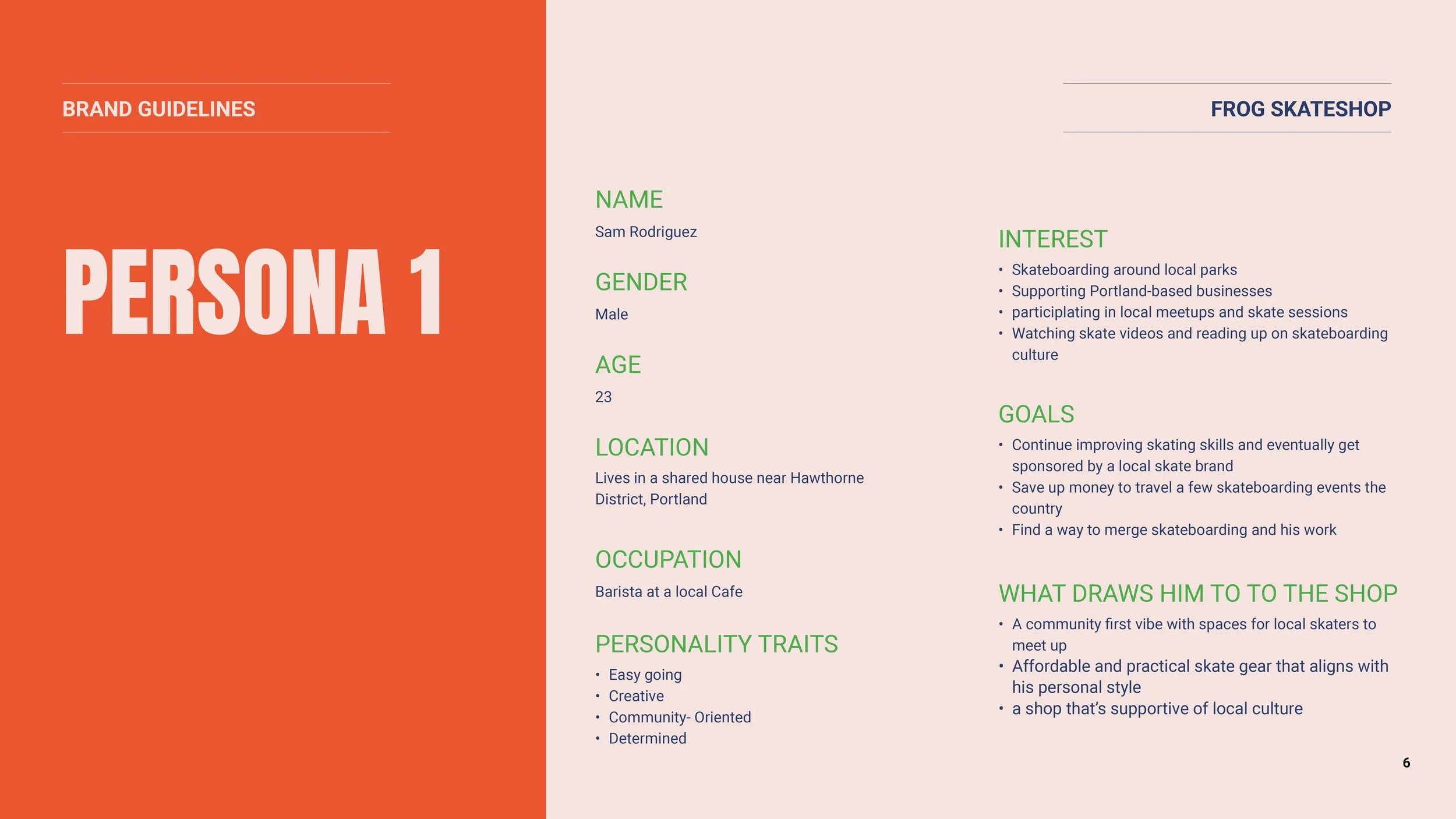
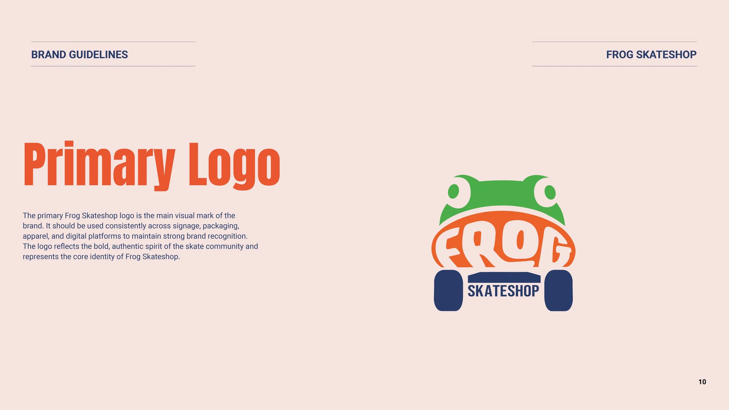
At this stage, I revisited the logo and brand squares to strengthen the overall direction. I realized the original hand illustration representing the letter F and the skateboard wasn’t as clear as I wanted, so I refined the logo to make it bolder and more recognizable.
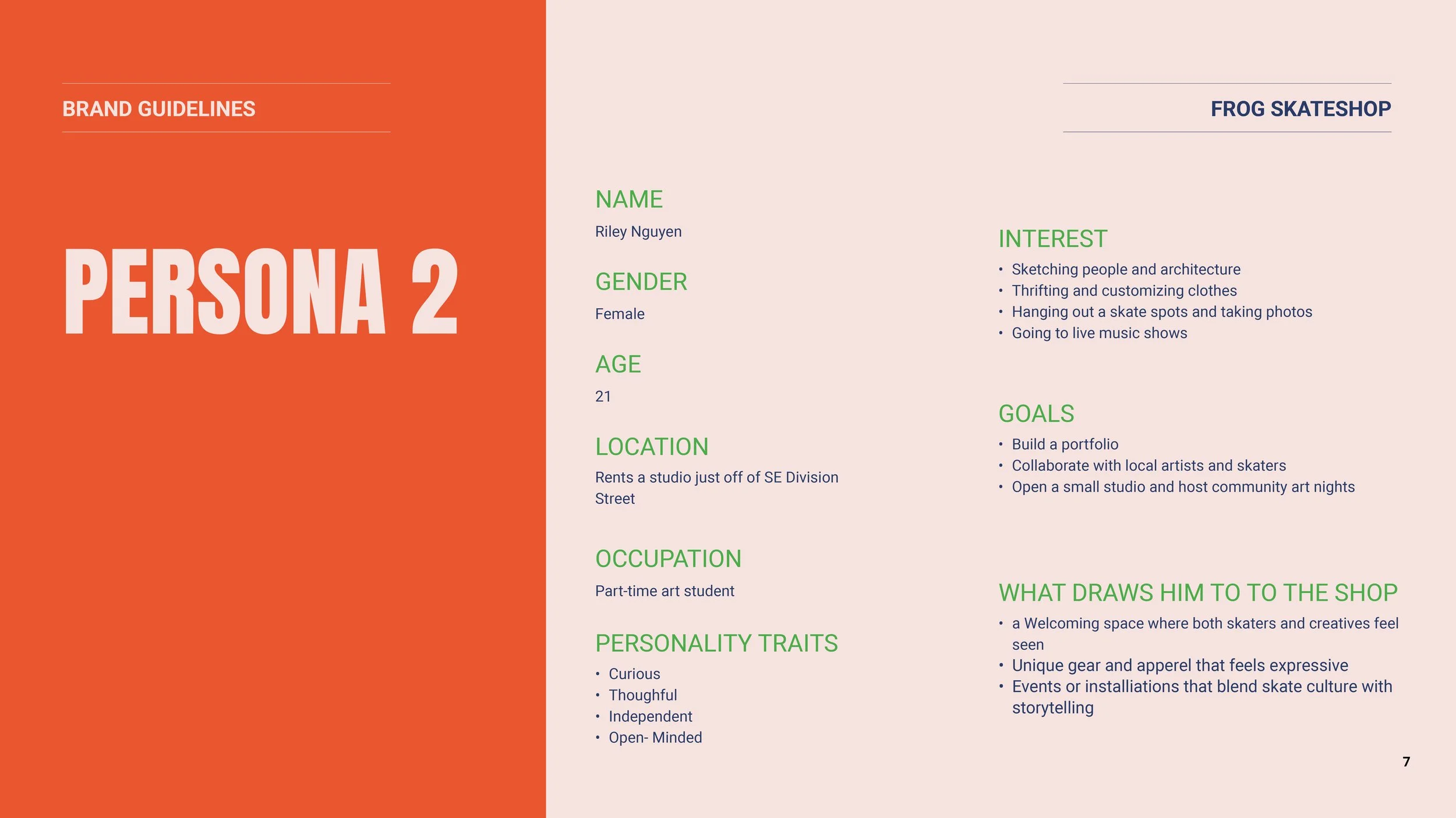
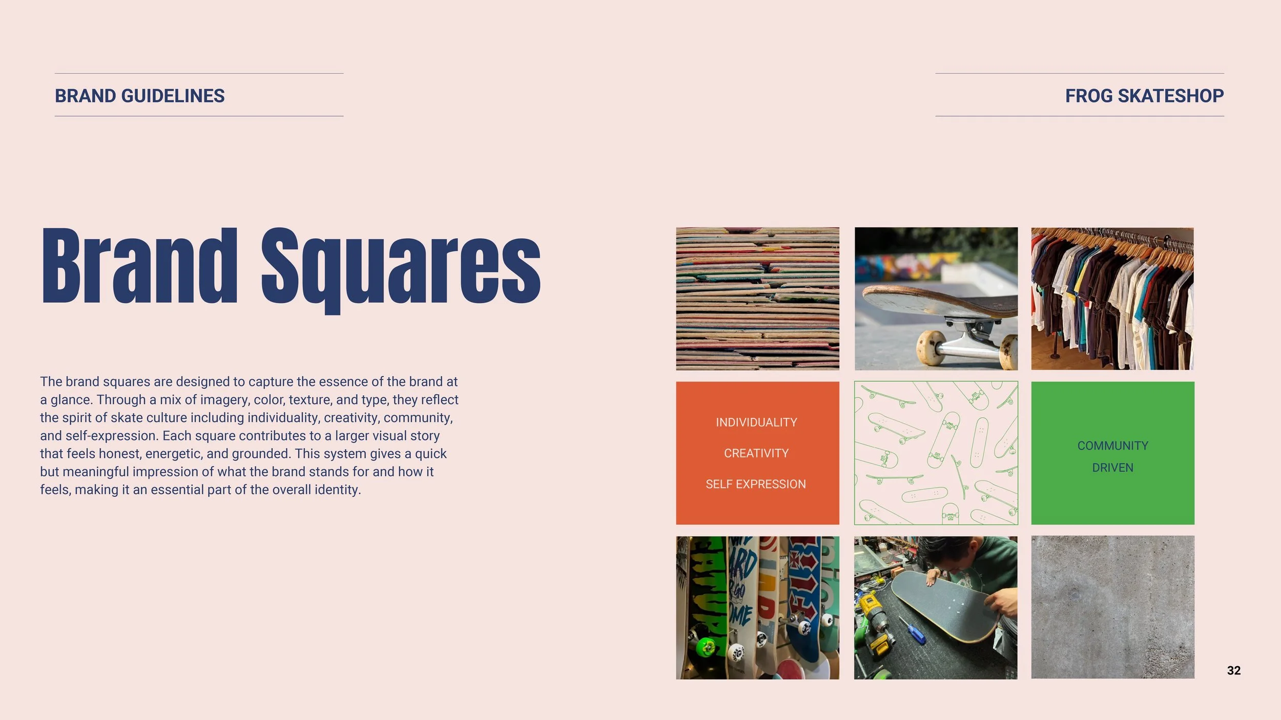
For the brand squares, I aimed for a cleaner yet edgier look that still felt simple and cohesive. I incorporated textures that resonated with skating culture, adding depth and character while keeping the design versatile and visually engaging. This process helped me develop to the final stages of the visual identity of the brand.
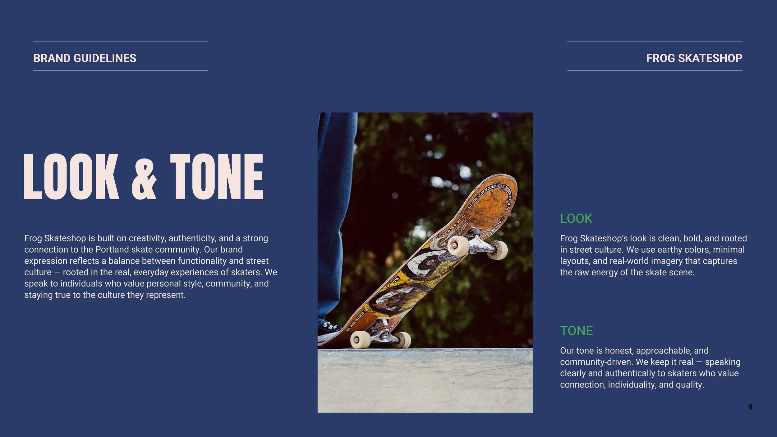
Final Elements
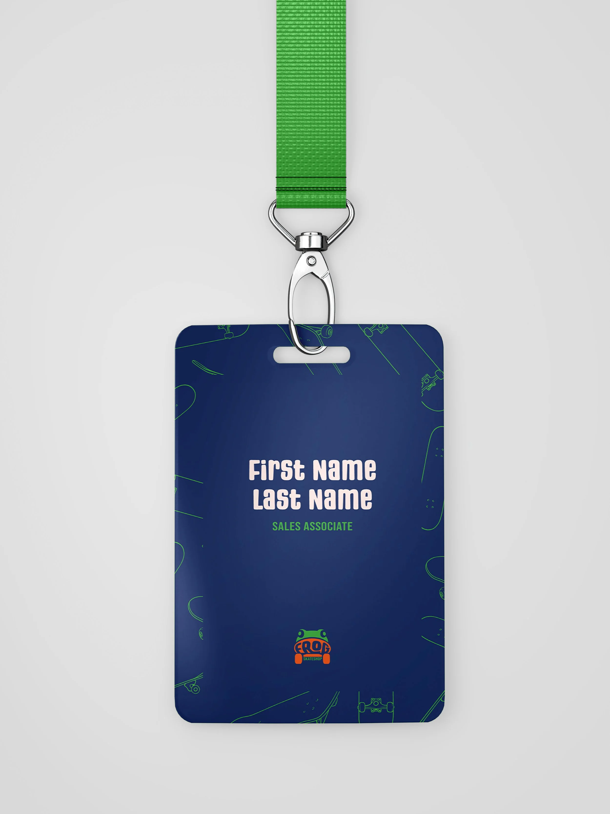
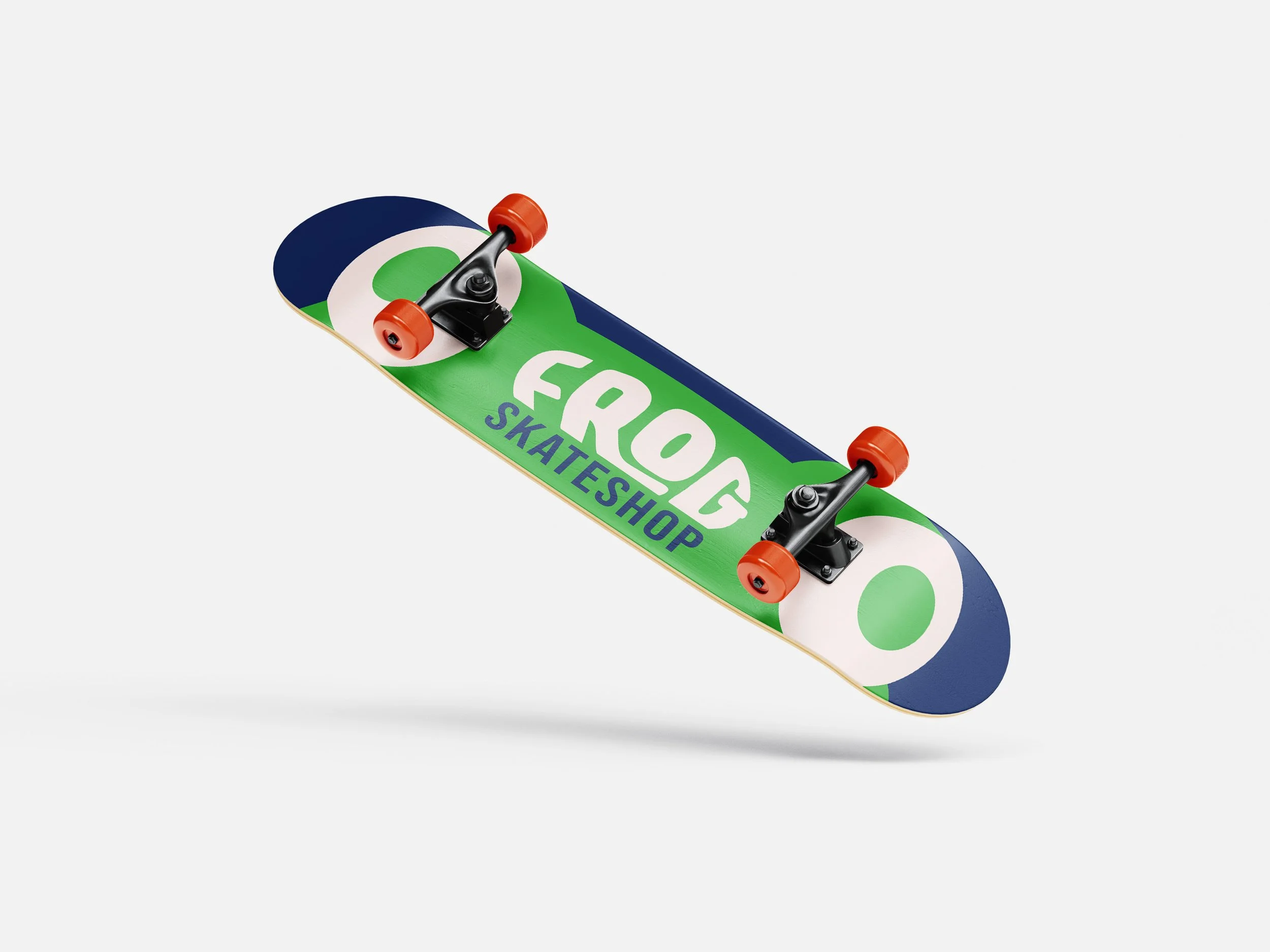

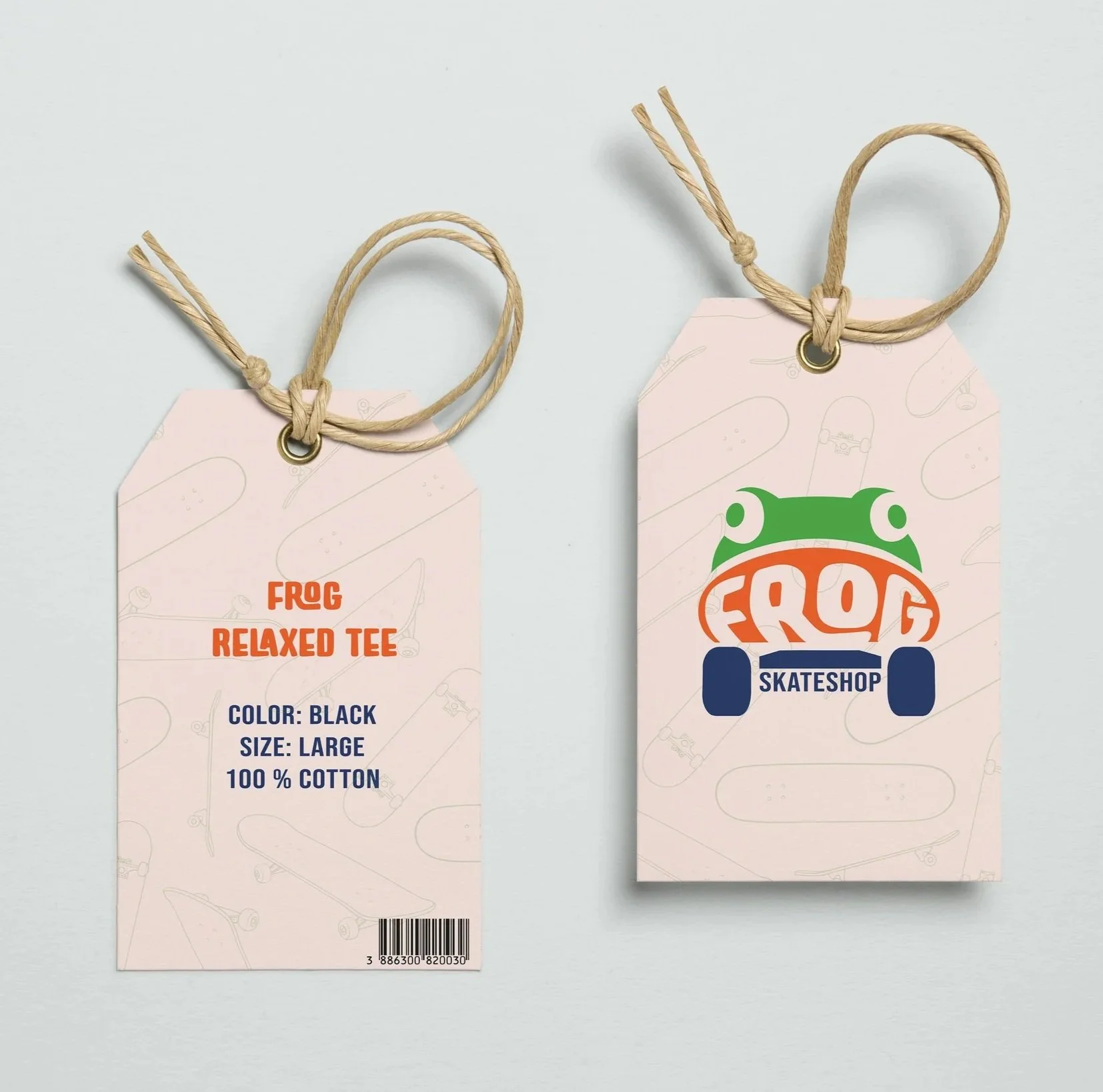
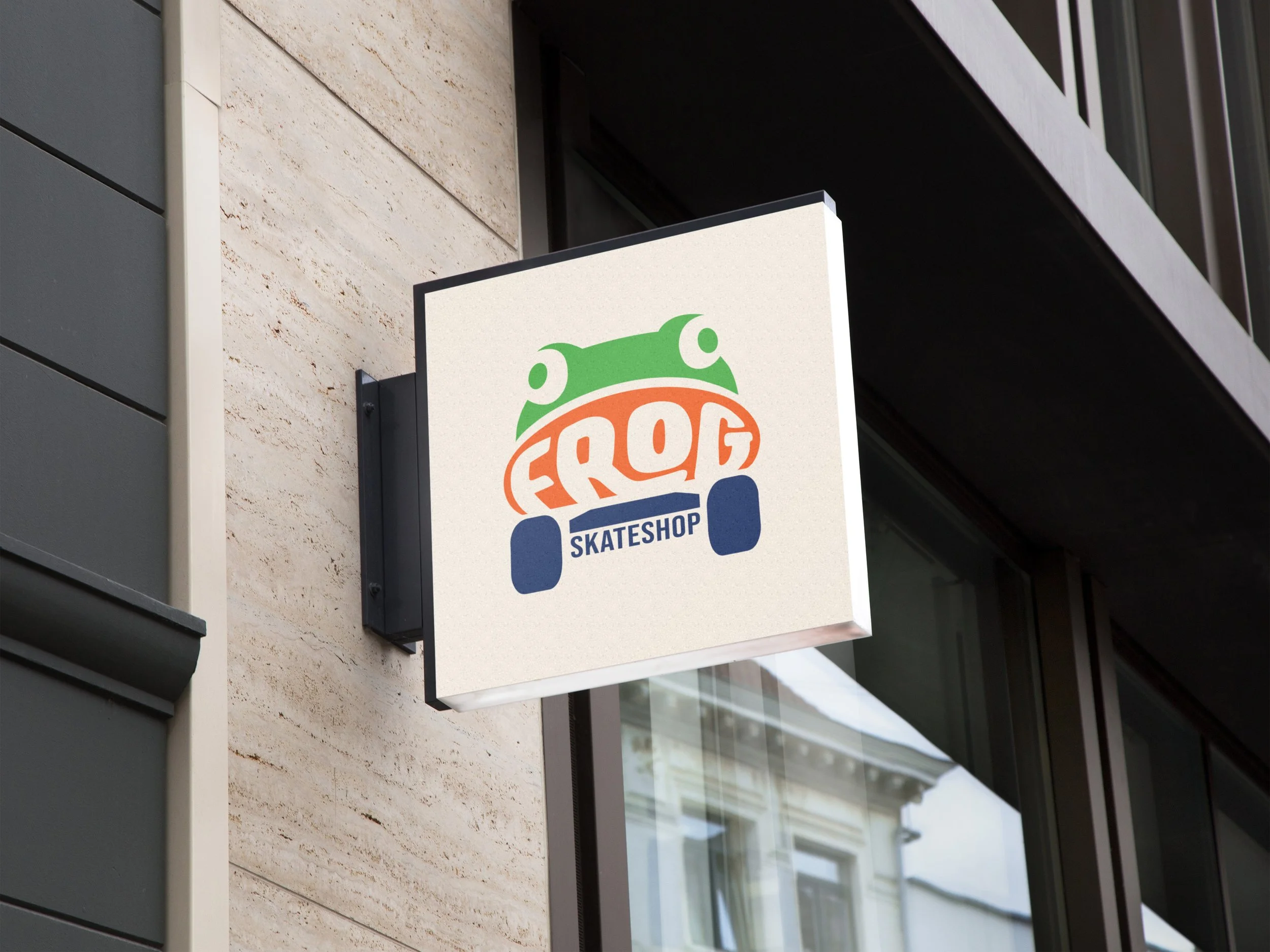

This collage showcases some of the final mockups for the brand as presented in the brand guidelines. It highlights how the logo, typography, color palette, and textures come together across different applications, demonstrating the versatility and cohesion of the visual identity. These mockups provide a glimpse of how the brand can be applied in real-world contexts while maintaining a consistent and polished aesthetic.
View the Final Brand Guidelines Here!