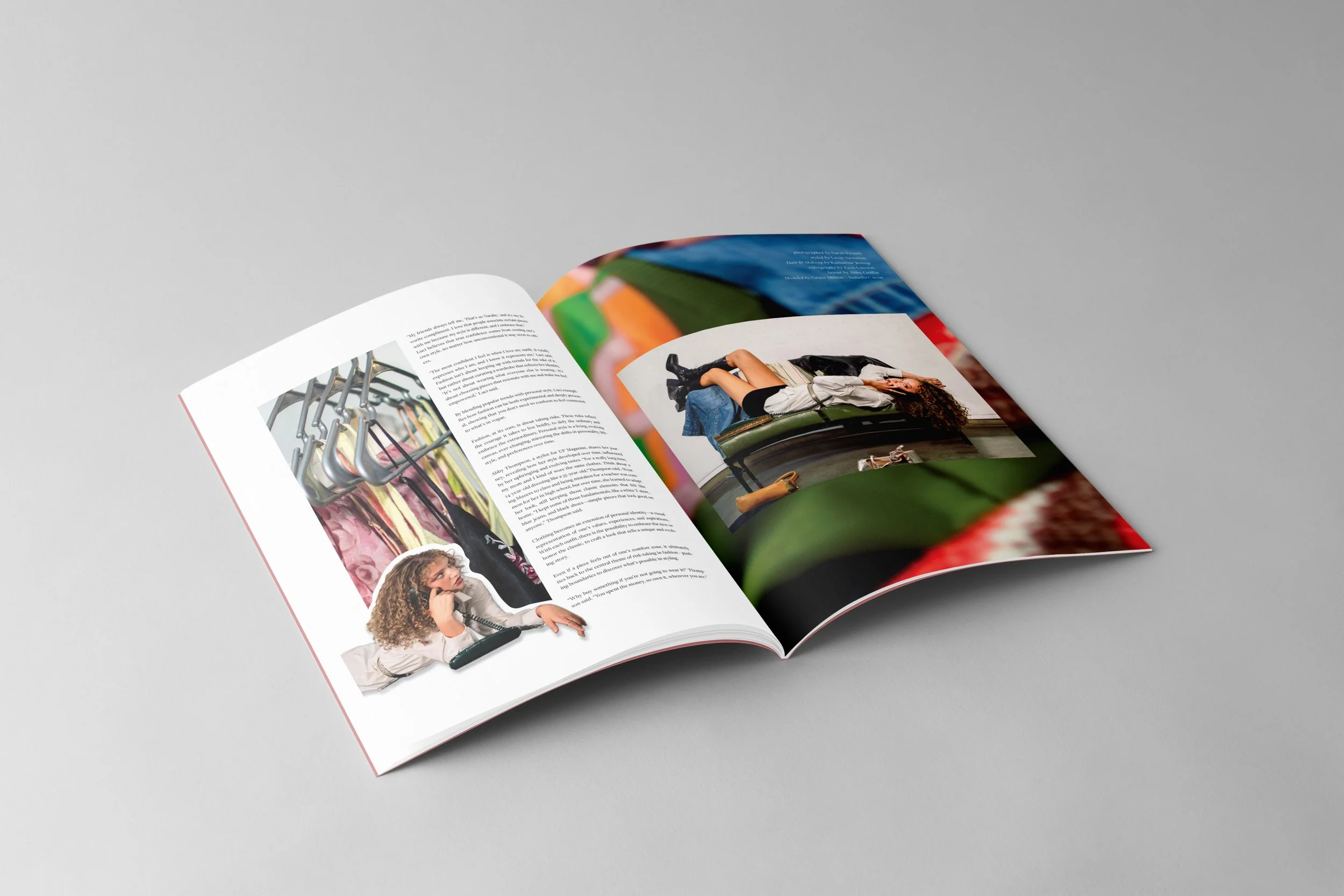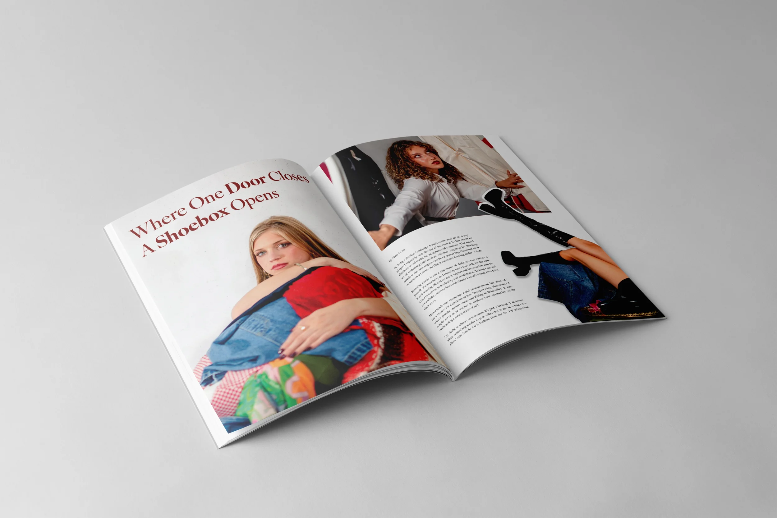
Created for UP Magazine’s fall issue, Devour, this spread focuses on sustainable fashion and the impact of fast fashion. Working closely with the writer and photographer, I designed a layout that highlights key information, supports the narrative, and presents the content in a visually engaging way that reflects the theme of conscious consumption.

Inspiration
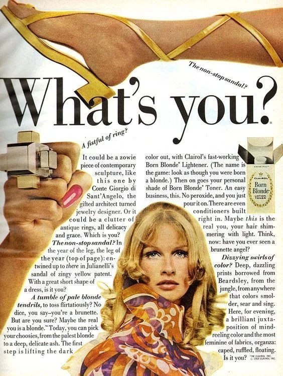
For this spread, I wanted the design to celebrate textiles and fashion by emphasizing the texture, layering, and movement of clothing. I drew inspiration from early 2000s fashion layouts that often paired bold serif typefaces with playful, cut-out imagery. This approach allowed me to give the photos a dynamic, editorial feel while keeping the overall composition engaging and lively.
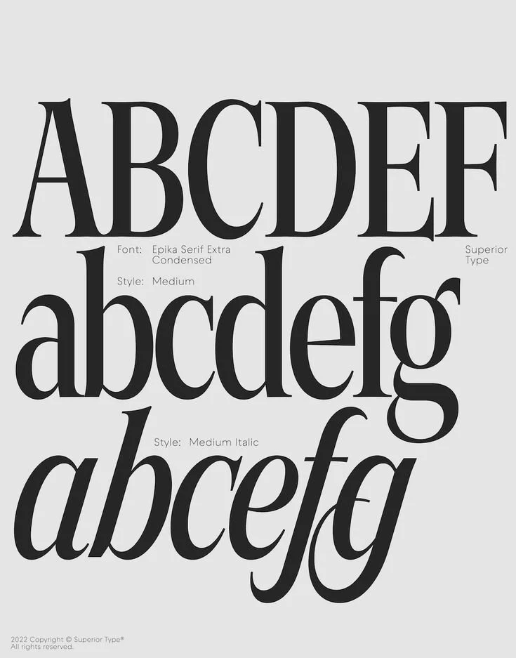
I chose a serif typeface to echo the 2000s fashion aesthetic and create a sense of sophistication that balanced the playful nature of the cut-out images. By experimenting with overlapping and scattered placements, I could bring a sense of movement and energy to the layout, letting the images interact in a fun and unexpected way.
The cut-out technique became a key visual device, letting me isolate textures, garments, and details to draw attention to specific elements while maintaining a cohesive rhythm across the spread. This method also allowed the images to feel layered, almost tactile, reflecting the theme of textiles and fashion.
Overall, the design combines nostalgia, texture, and playful composition to create a spread that is visually engaging, editorially inspired, and highlights the detail and artistry of the clothing and fabrics.
Final Layout