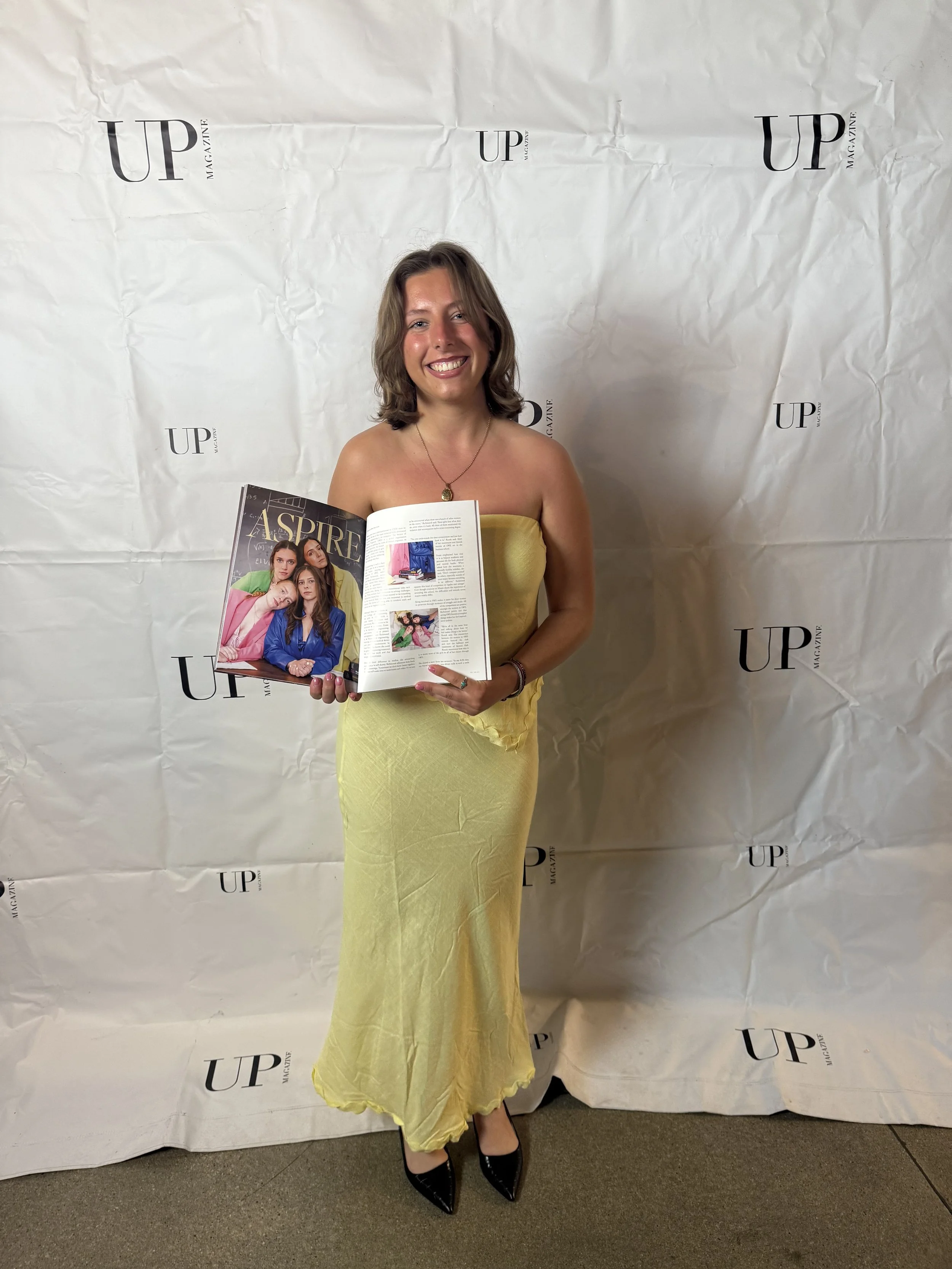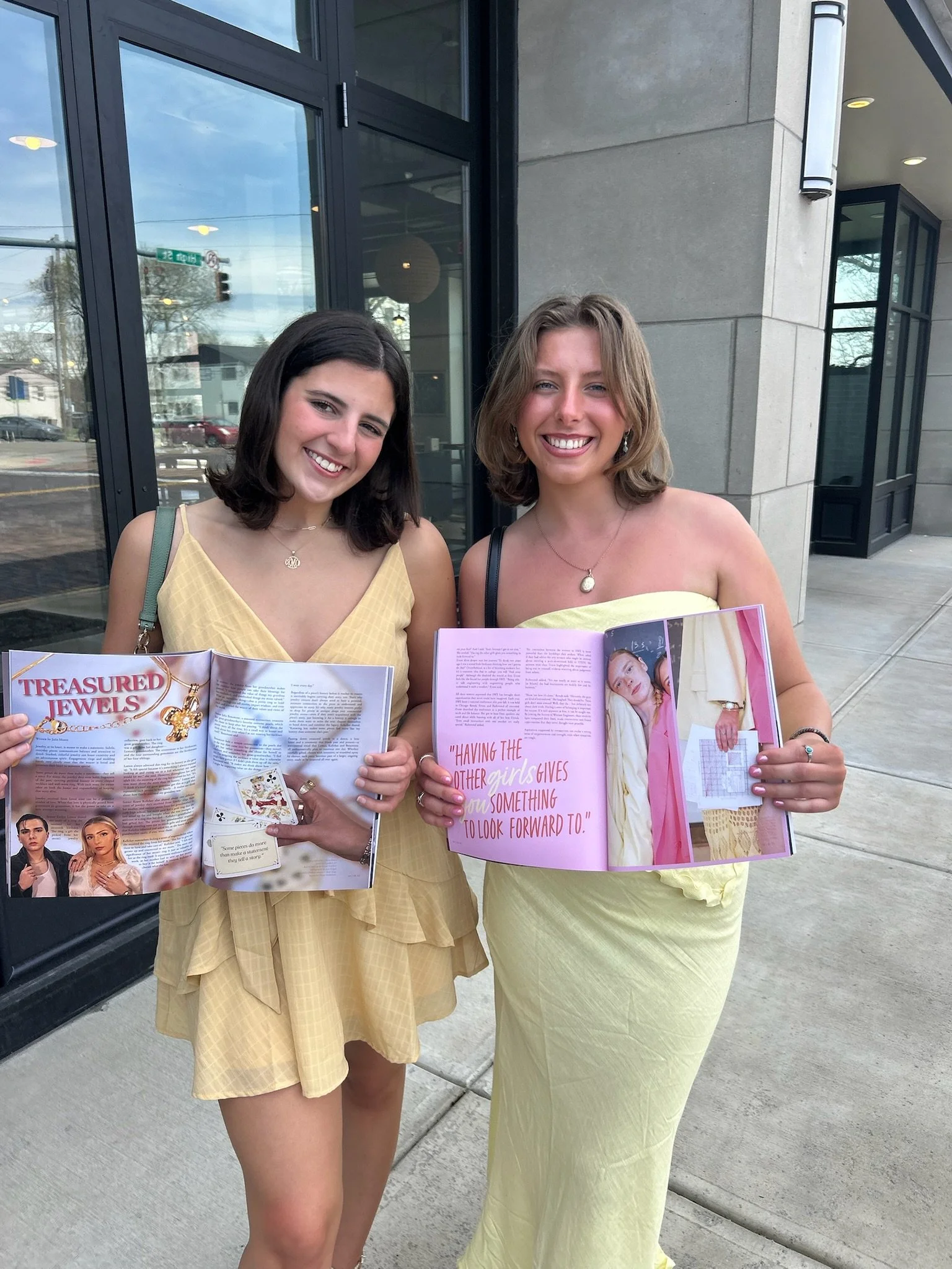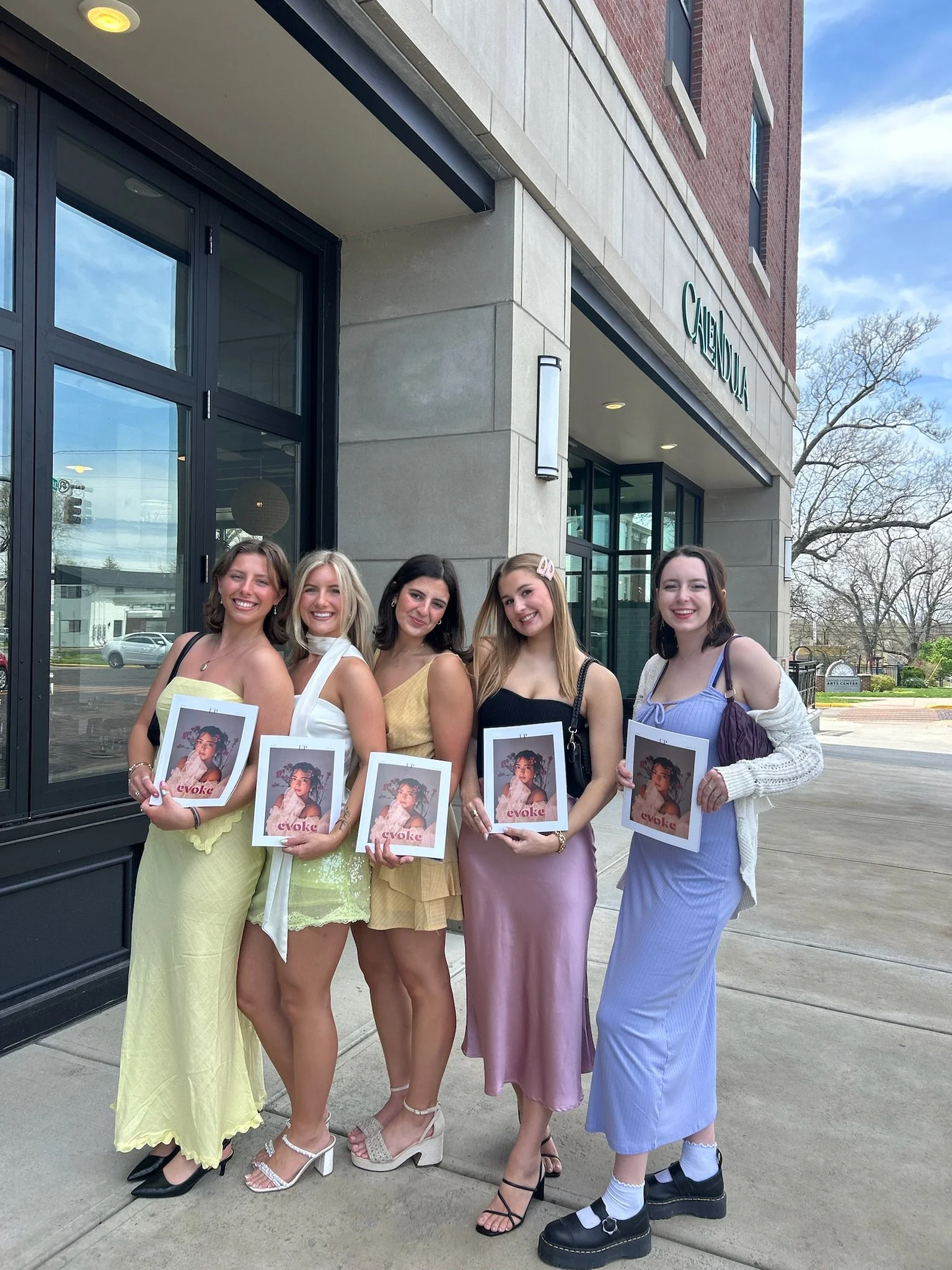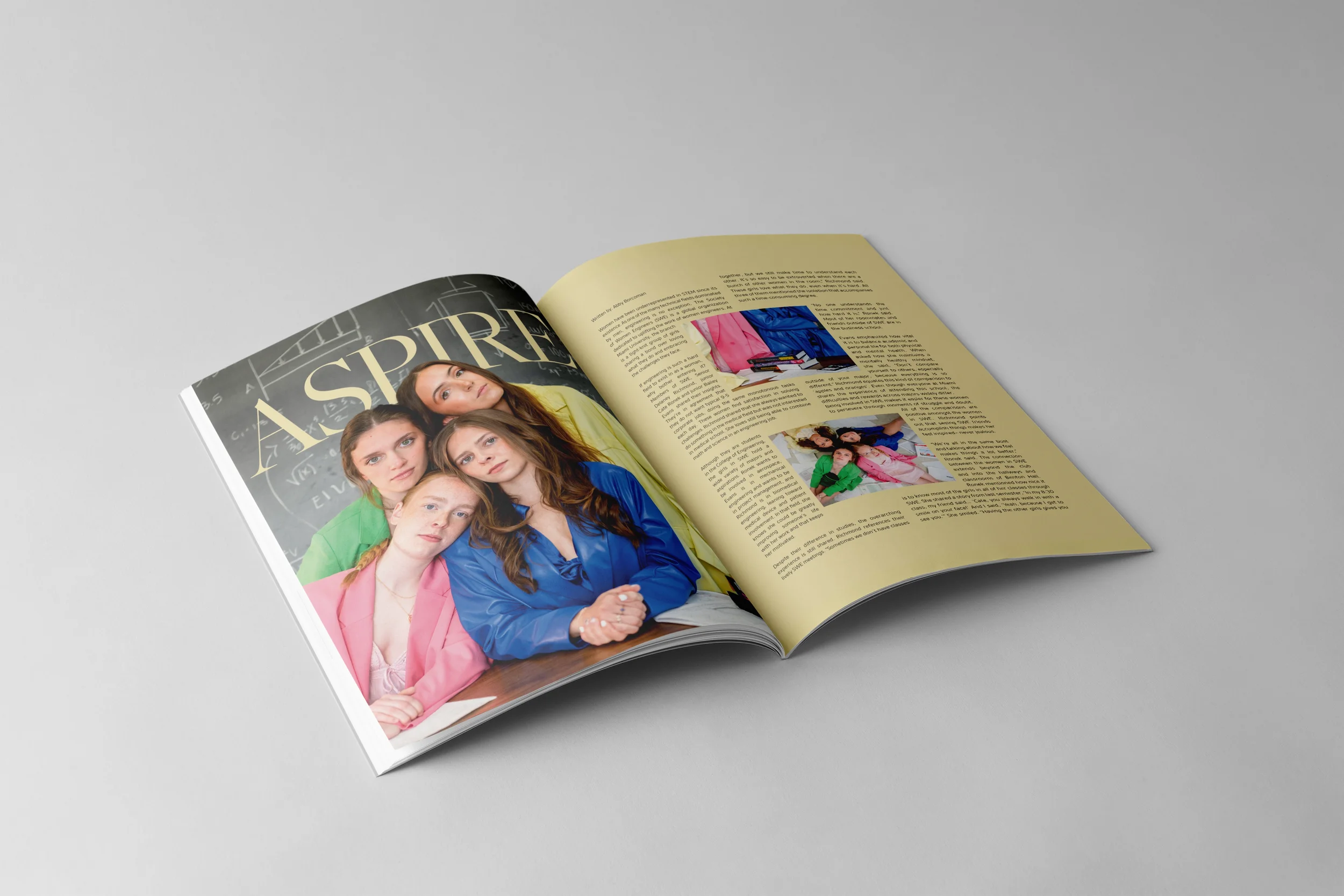
Created for Evoke’s spring issue, this spread highlights women in STEM and celebrates friendship and collaboration. Working closely with the writer and photographer, I designed a layout that emphasizes the photography, incorporates playful and thoughtful design elements, and supports the story in a clean, minimalist way.


Inspiration
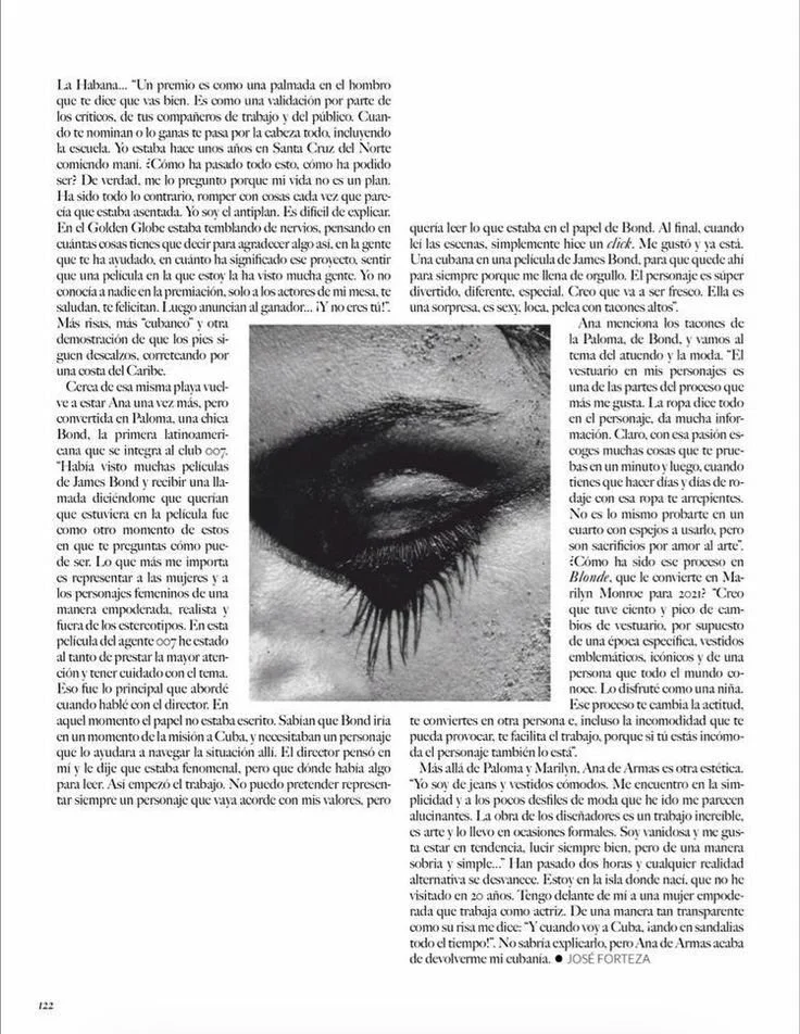
For this spread, I wanted the design to feel clean, minimalist, and focused on celebrating women in STEM and the theme of friendship. The goal was to let the photography take center stage while using design elements to complement and enhance the imagery rather than overwhelm it.
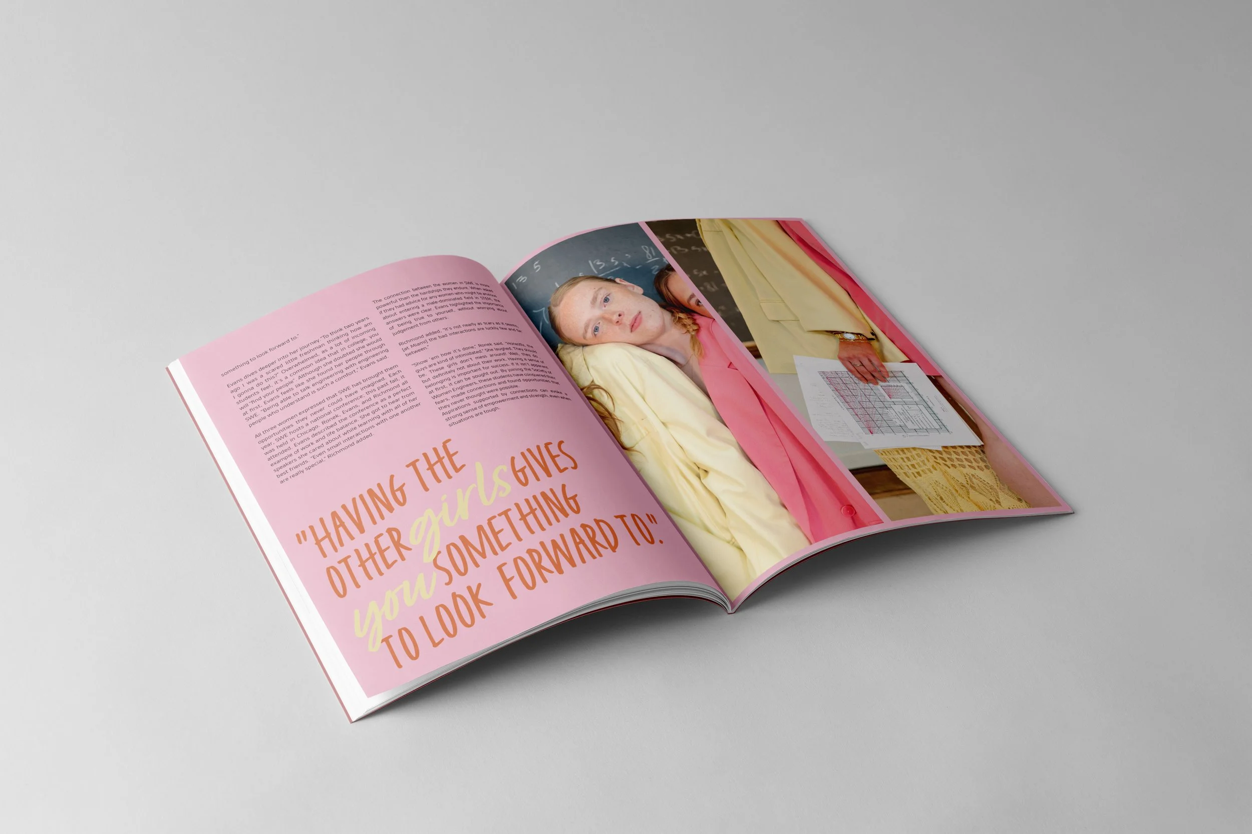
I chose a minimalist layout with ample white space and carefully pulled colors from the photography to use as subtle pops throughout the spread. On one of the pages, I incorporated a playful handwritten font to add a personal, approachable touch, creating contrast and visual interest while keeping the overall design cohesive.
My inspiration came from layouts that use simplicity and restraint to highlight content, relying on typography, color accents, and composition to guide the reader’s eye. I experimented with small bursts of color and typography to add rhythm and personality without distracting from the photography.
Overall, the design blends minimalism, thoughtful color use, and subtle typographic play to create a spread that feels fresh, engaging, and celebratory of friendship and women in STEM.
Final Layout

Release Party
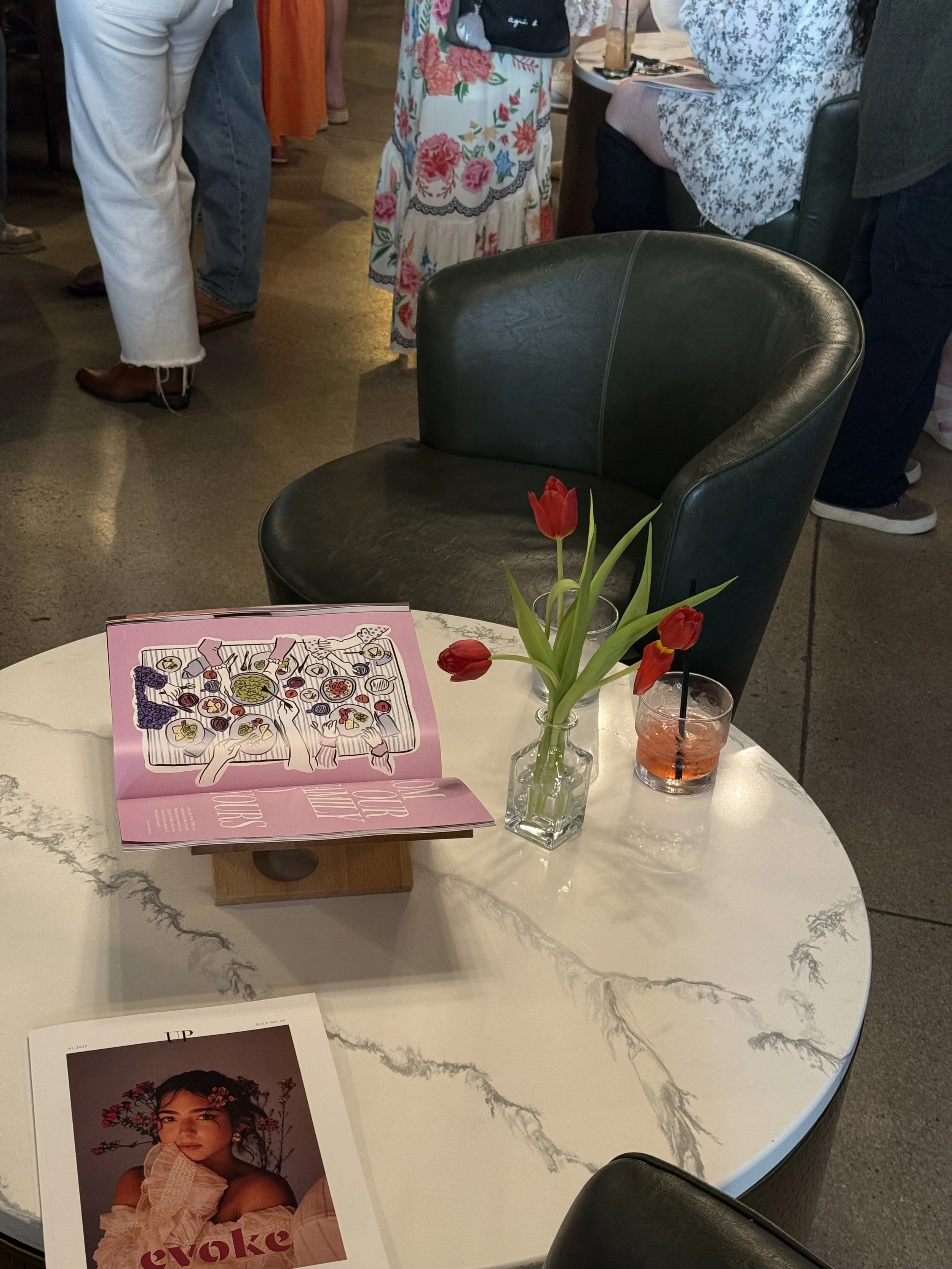
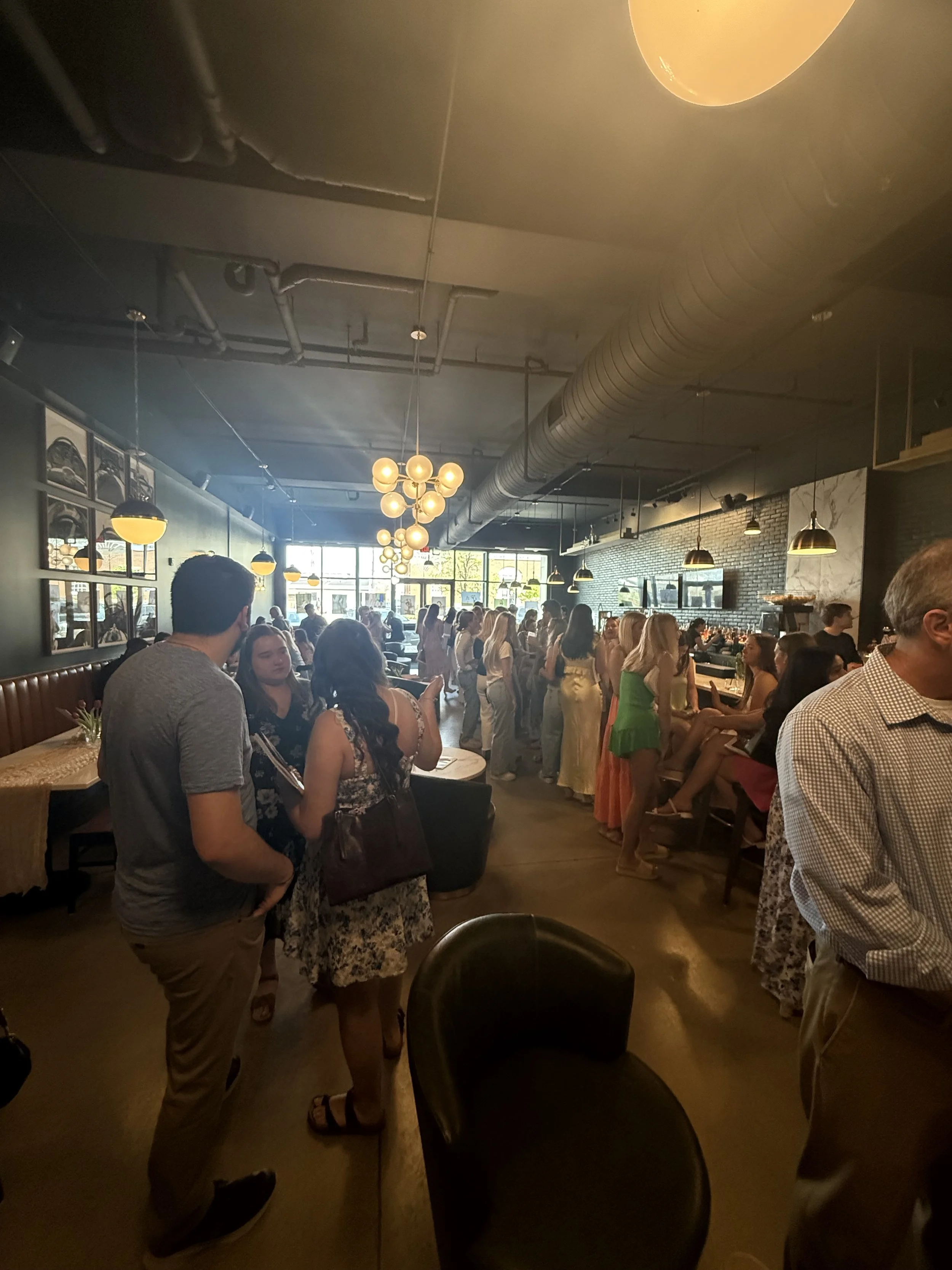
Here is a collection of captured moments from the release party, highlighting the energy, excitement, and fun of celebrating this project with everyone involved.
