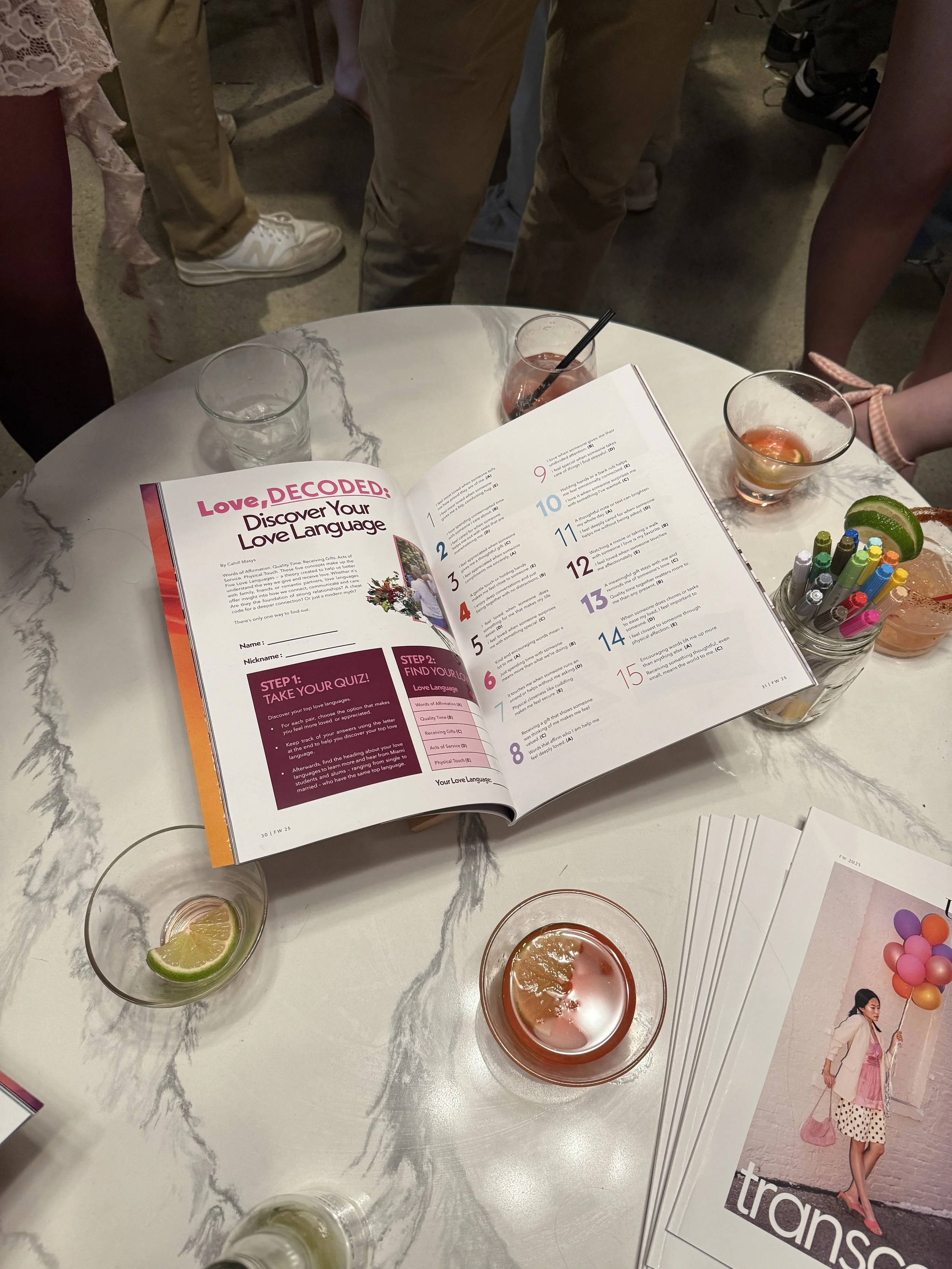
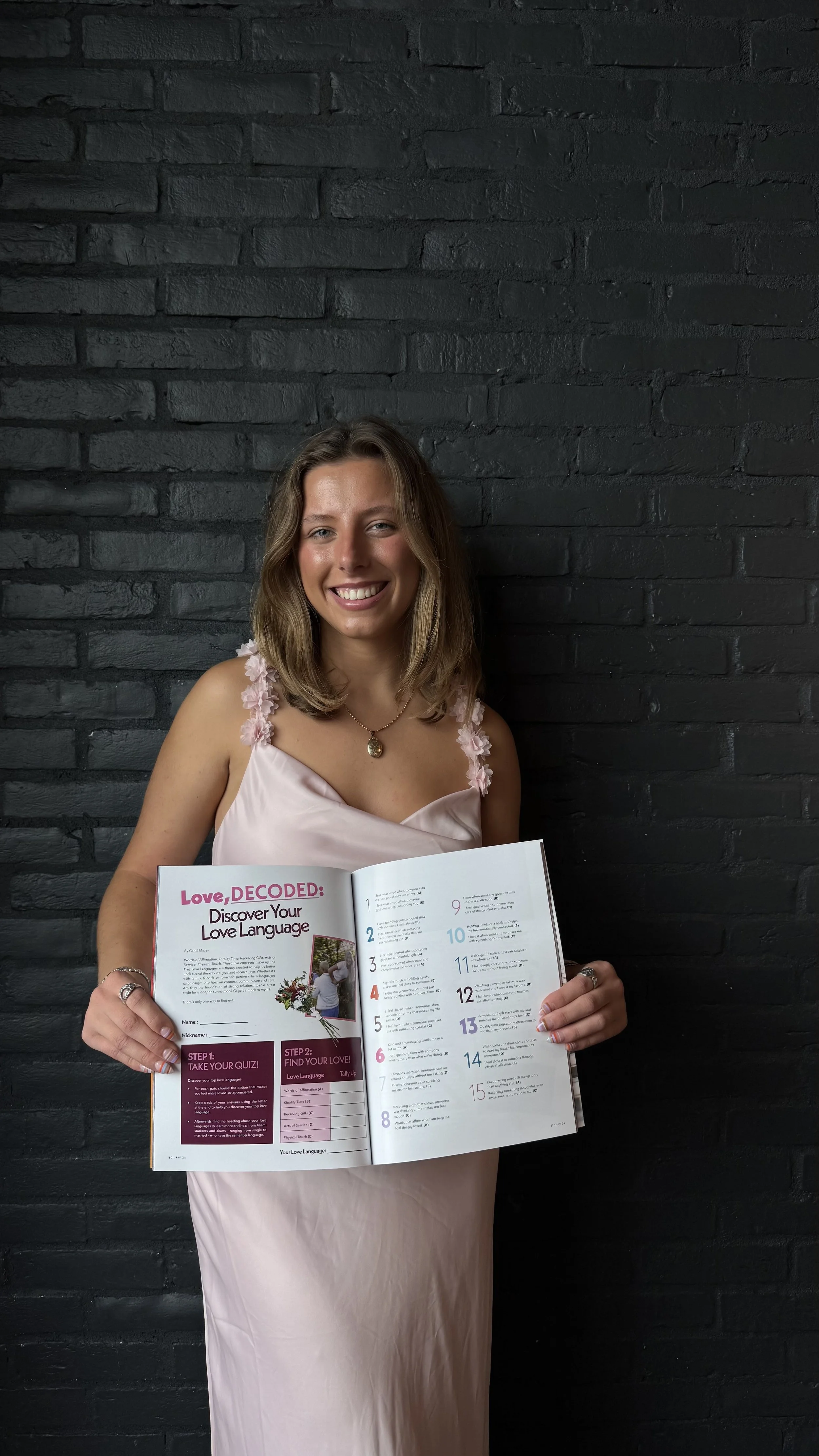
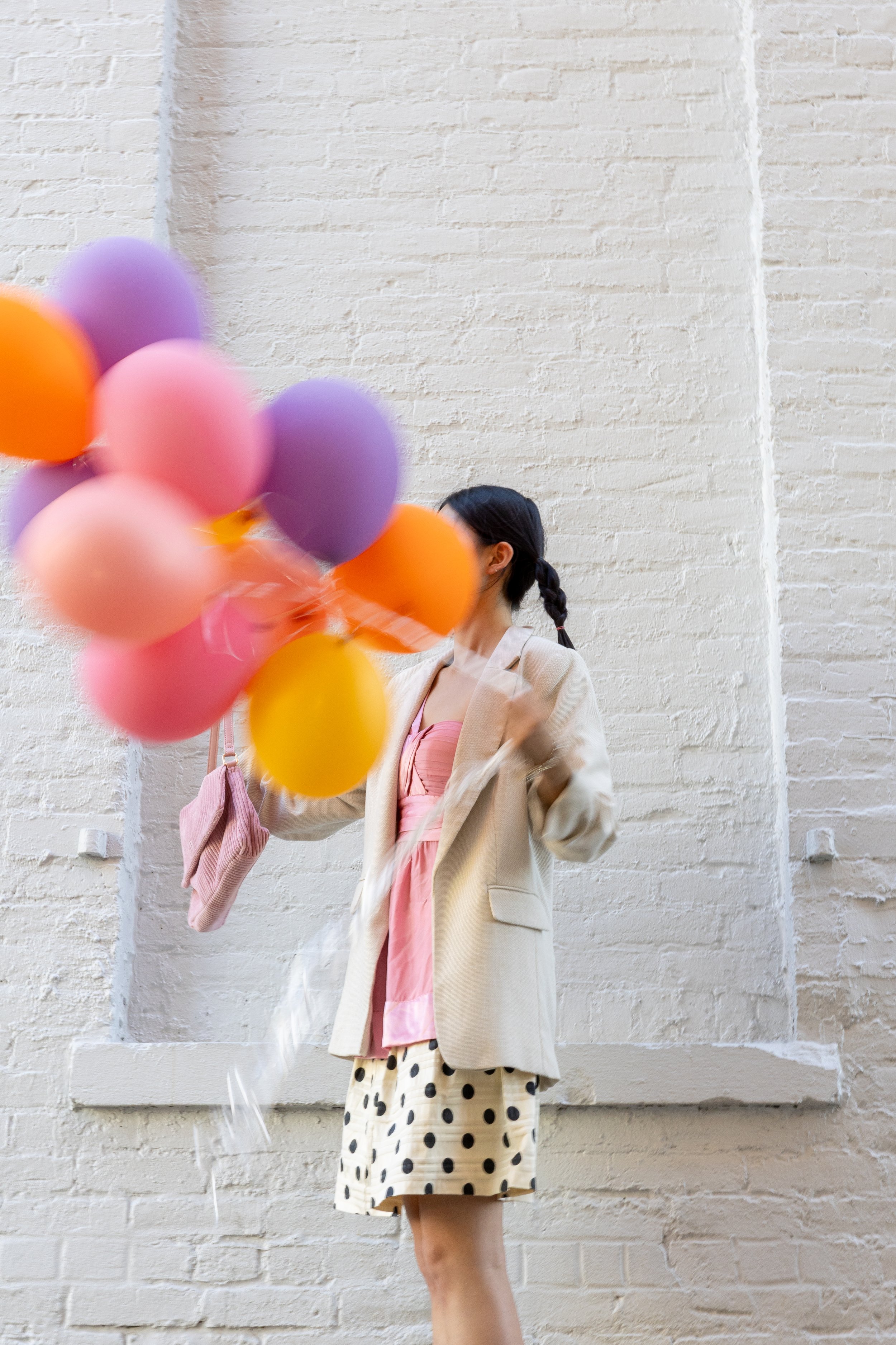
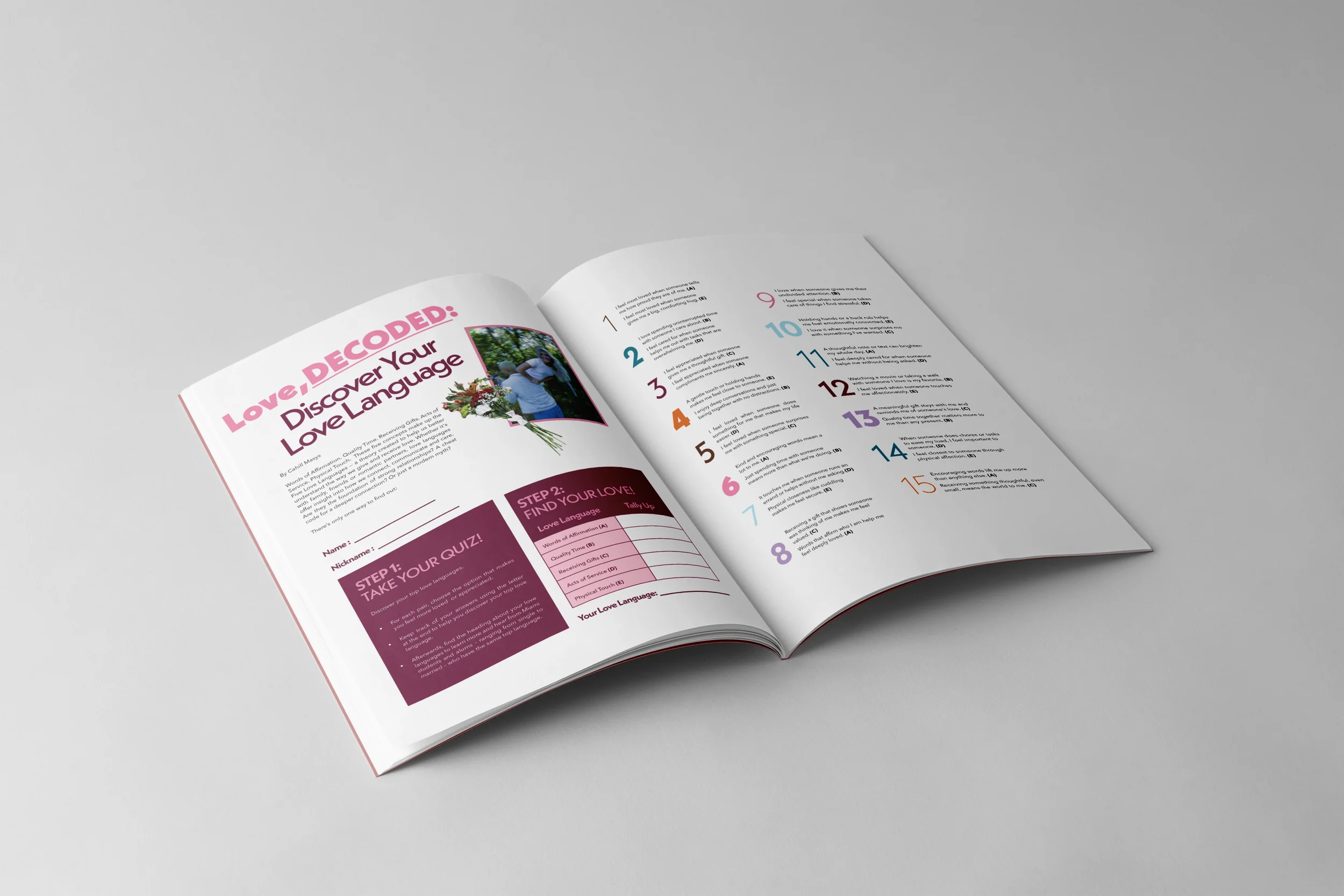
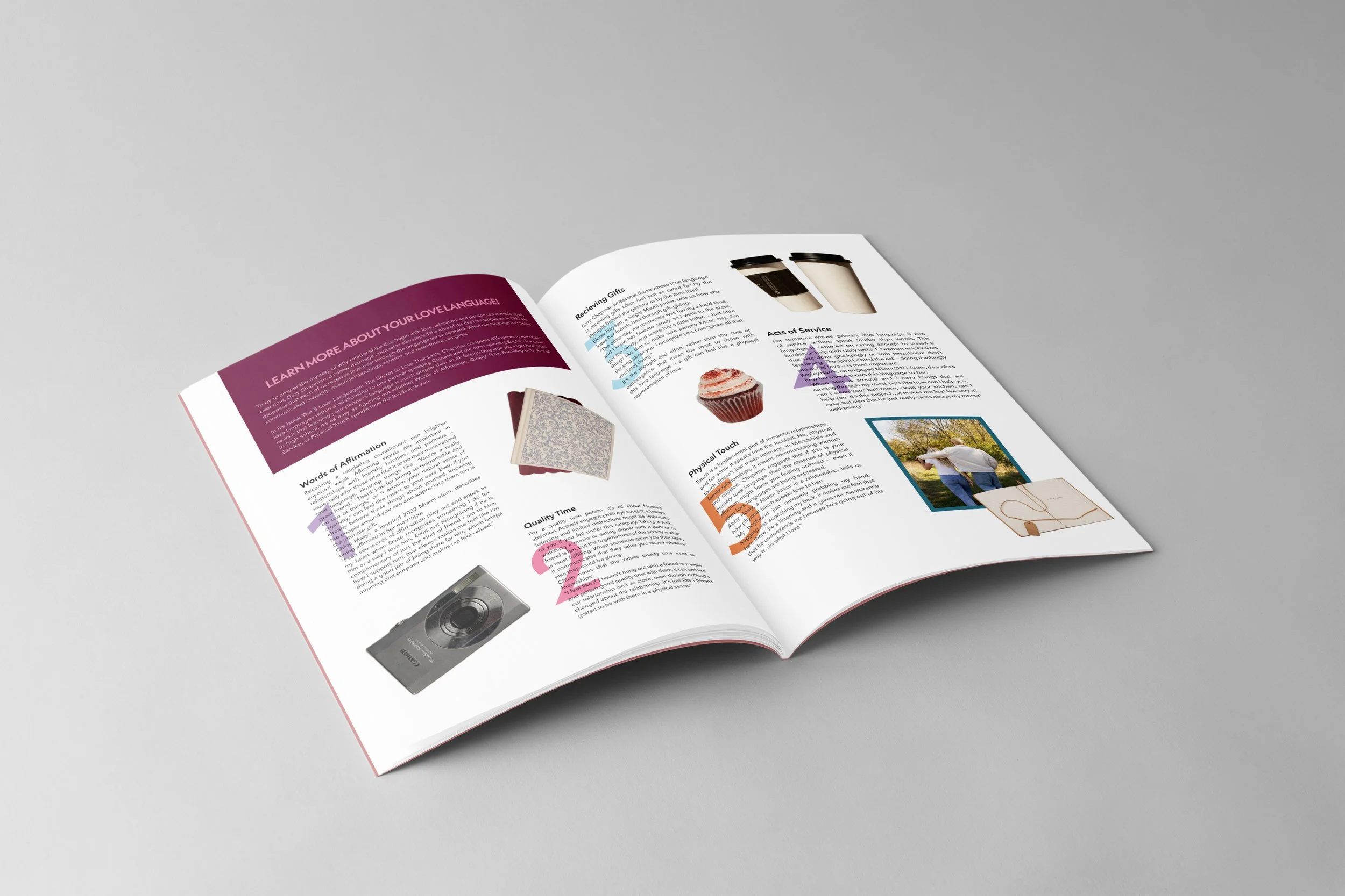
Created for UP Magazine’s fall Transcend issue, this spread turns the article into an interactive quiz that helps readers identify their love language. Working closely with the writer and photographer, I designed a layout that guides the reader through each step, supports the story, and reflects the overall theme.

Inspiration
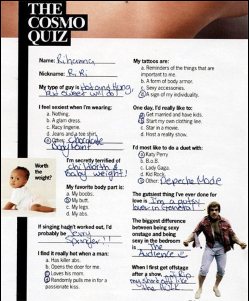
For this spread, I wanted the design to feel like a modern interpretation of early 2000s editorial design, especially the iconic Cosmo quizzes that made every page feel fun, bold, and self-reflective. Since the article focuses on discovering your love language, the quiz-like framework felt like the perfect visual reference and added an interactive quality to the layout.
I chose a clean sans-serif typeface to balance the nostalgic inspiration with a more contemporary tone. This helped keep the spread polished while still embracing the lively personality of 2000s magazines. The assigned color palette guided the overall cohesion, and I leaned into strong contrasts to create hierarchy and visual movement.
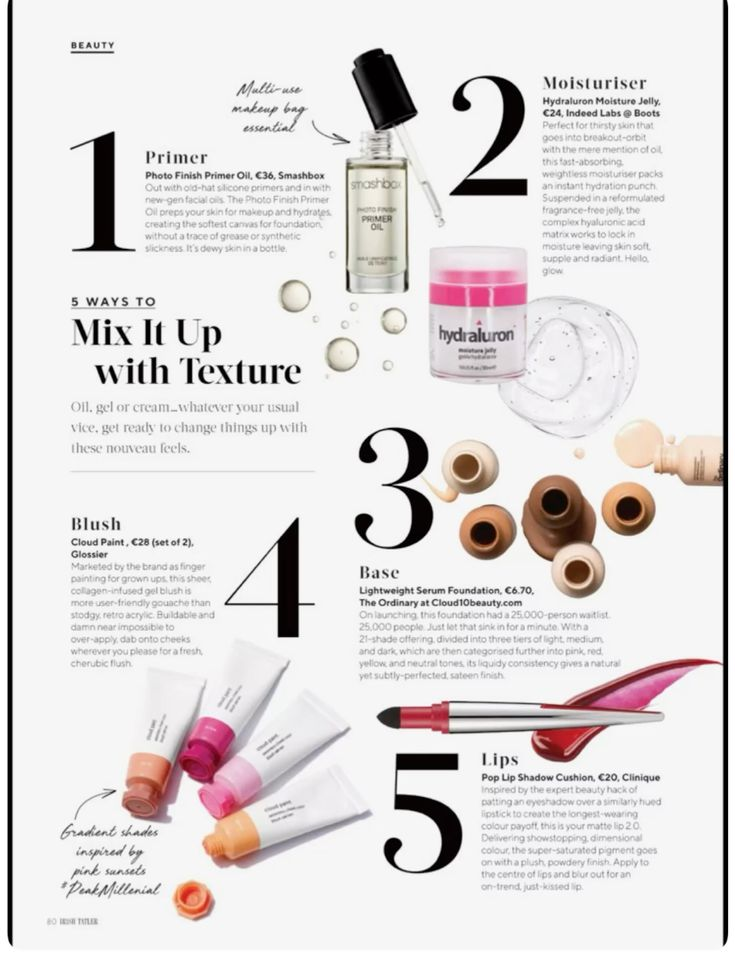
A lot of my inspiration came from editorial designs that feature oversized numbers, quick descriptors, and cut-out elements to lead the reader through the content. I brought those ideas into my layout to echo the quiz structure and create a sense of energy.
Overall, the design brings together nostalgia, structure, and boldness to capture the spirit of a 2000s quiz while presenting it with a clean and modern approach.
Final Layout
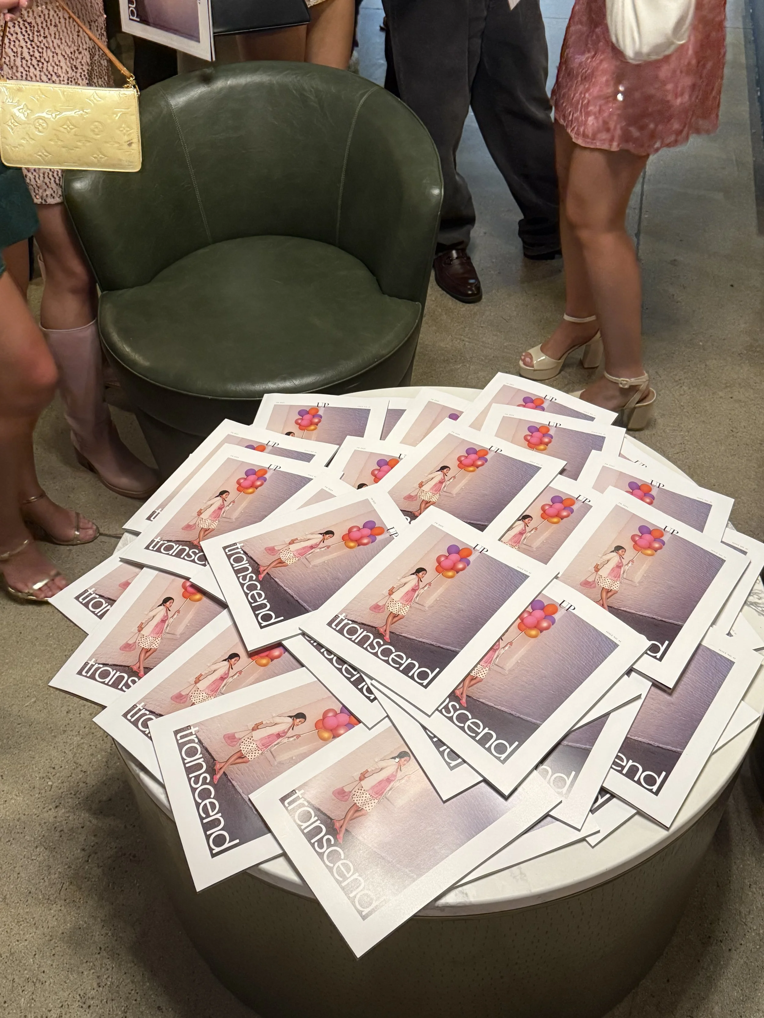
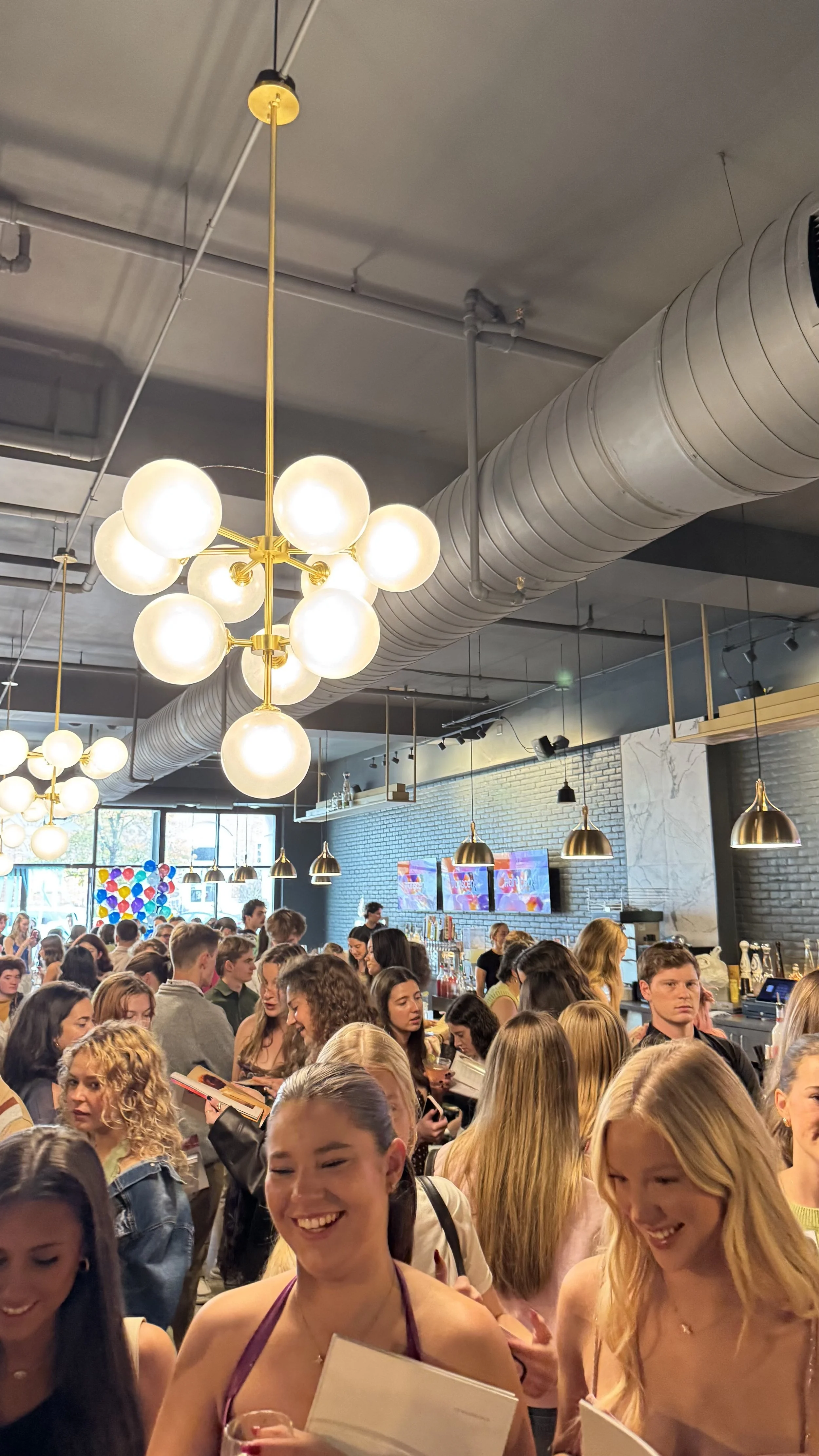
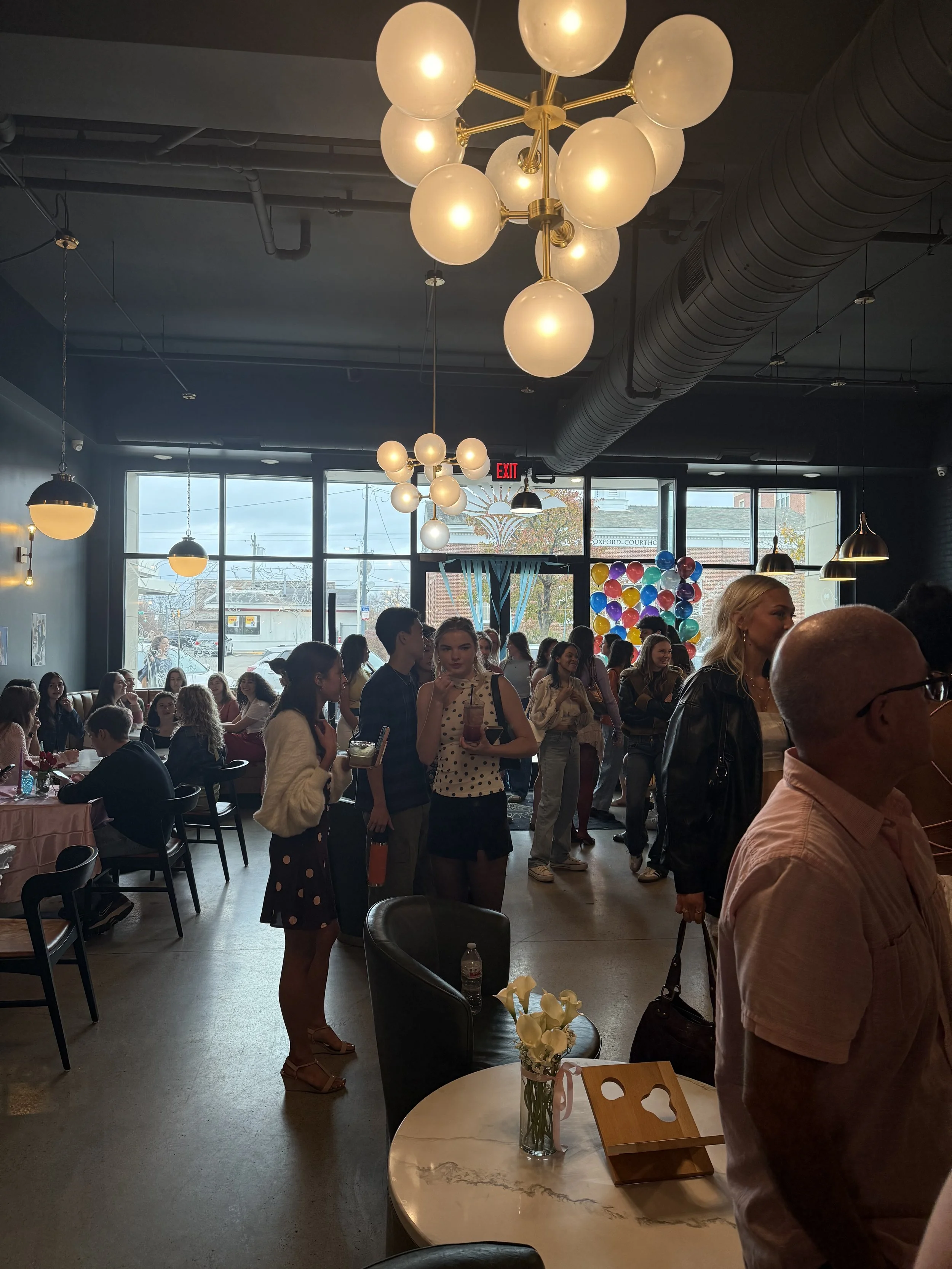
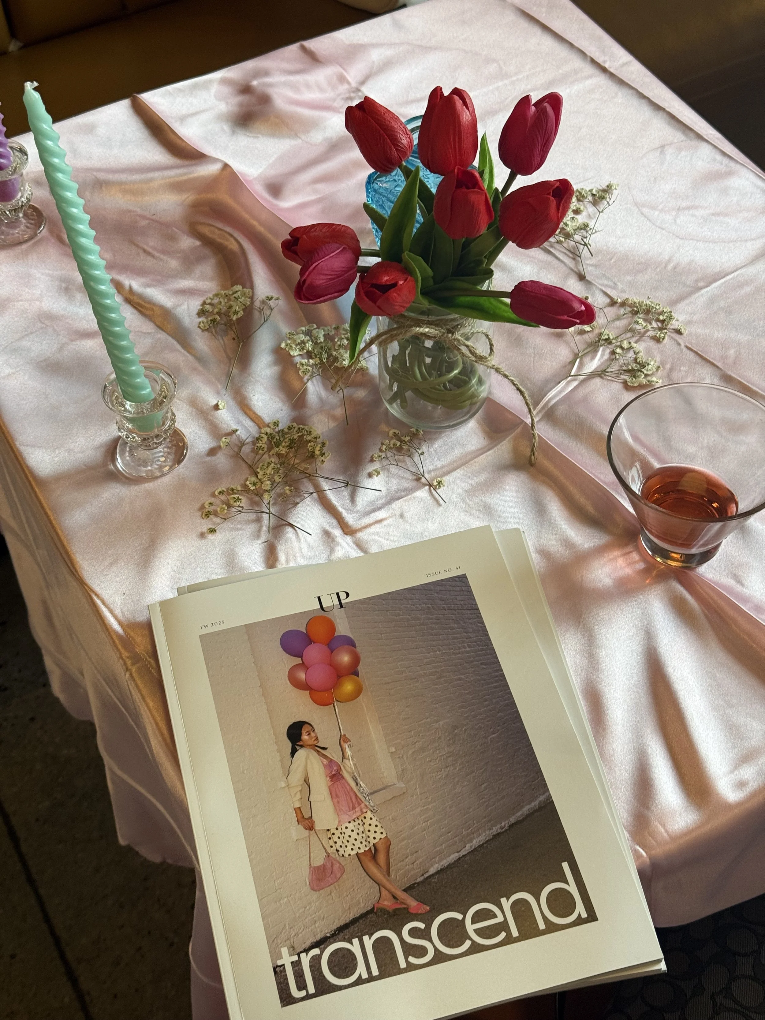
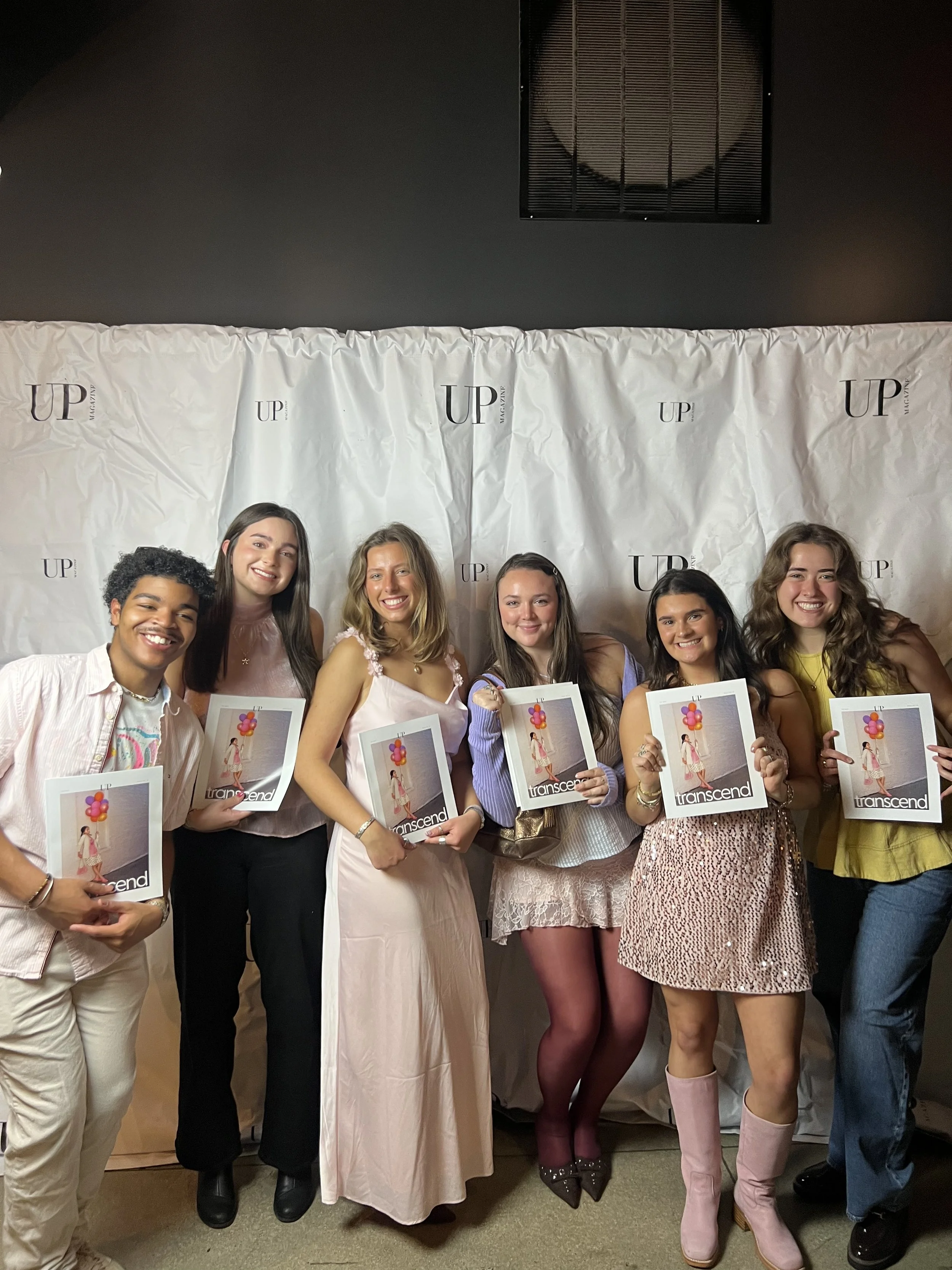
Release Party
Here is a collection of captured moments from the release party, highlighting the energy, excitement, and the fun of celebrating this project with everyone involved.