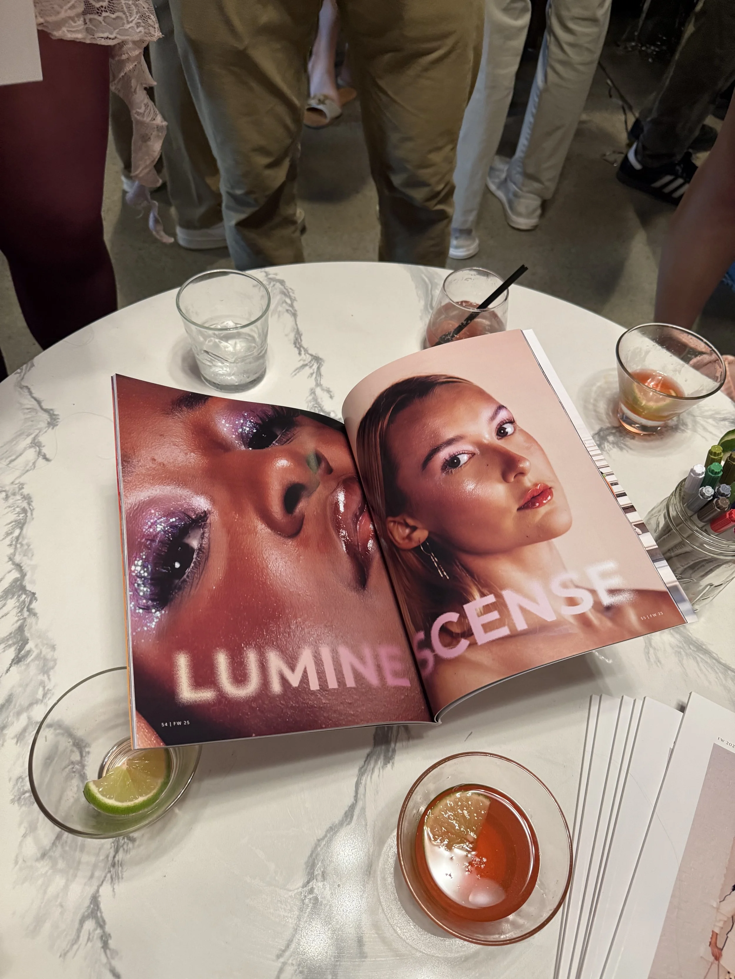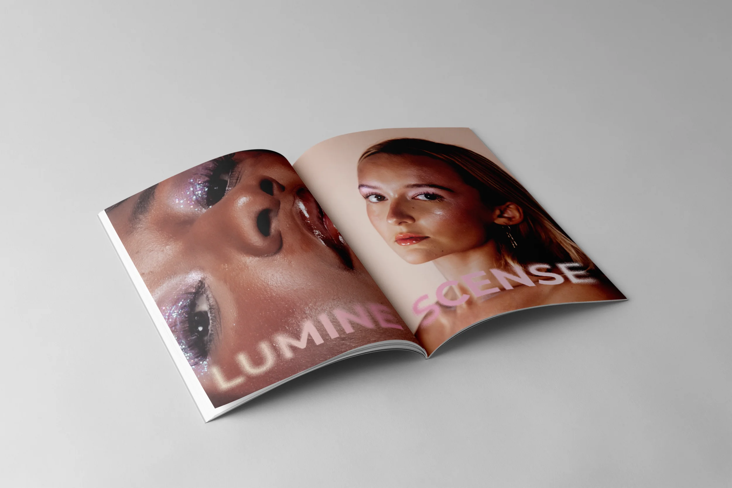
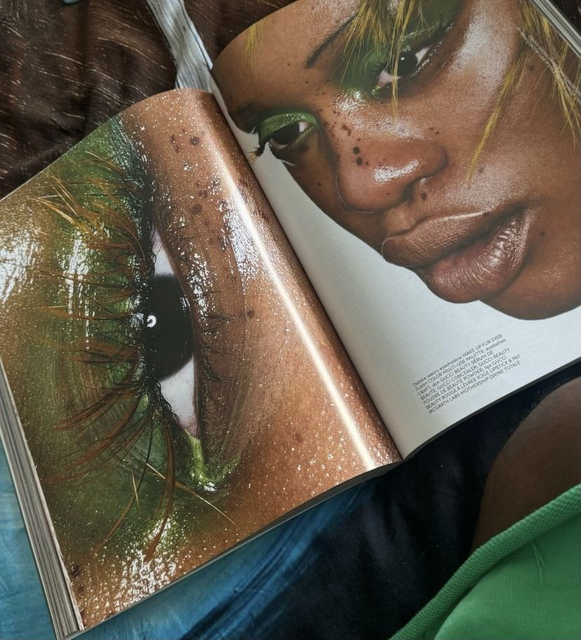
Created for UP Magazine’s fall Transcend issue, this spread features a makeup-focused portrait editorial. Working closely with the photographer, I designed a layout that enhances the imagery, supports the concept, and aligns with the overall theme.

Inspiration
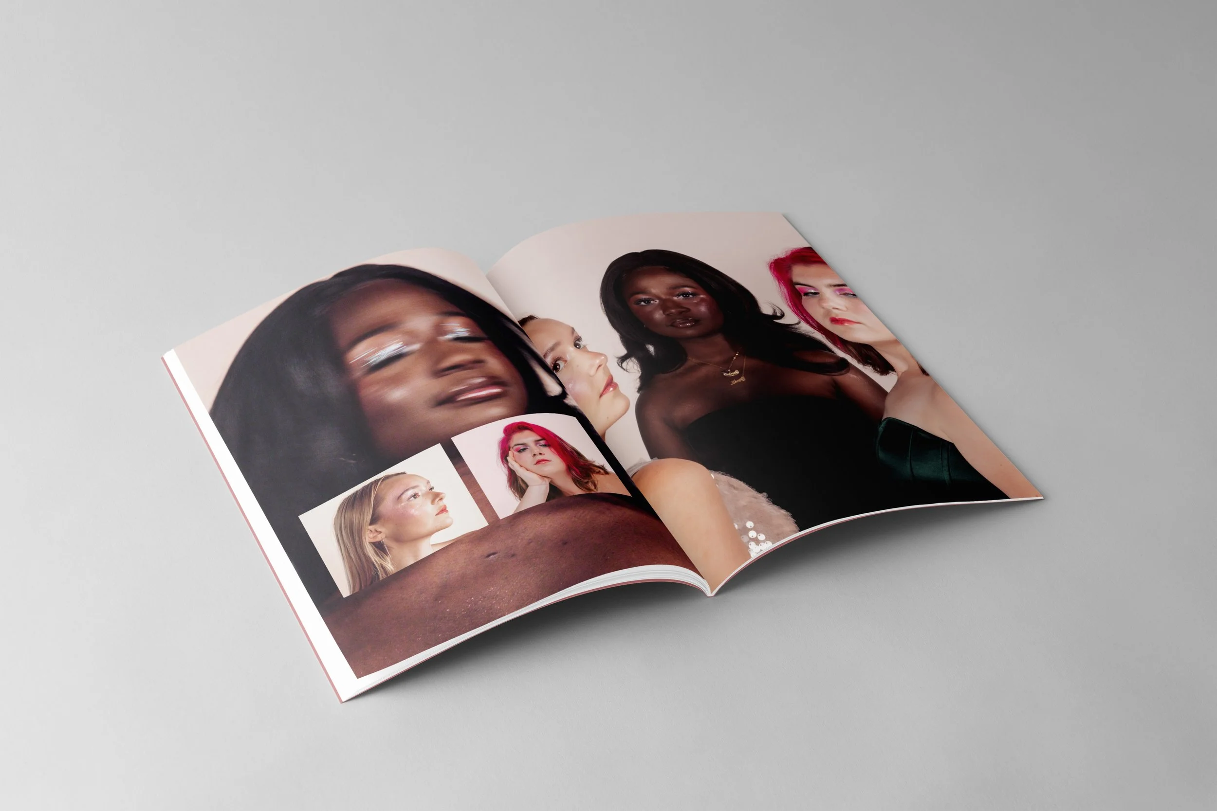
For this spread, I wanted the design to highlight the artistry of makeup by giving the photographs plenty of room to shine. The images I worked with were rich in detail, so I leaned into full-page layouts and close-up shots to emphasize texture, color, and the precision of each look. Pairing these tight crops with portrait-style images helped create a rhythm between detail and context.
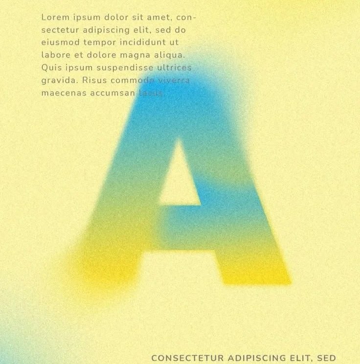
I used a clean sans-serif typeface to keep the layout modern and let the photography stay center stage. From there, I played with a scattered type arrangement inspired by the look of an eyeshadow palette. This approach added a subtle sense of movement and tied the typography back to the theme without overwhelming the imagery.
Some of the photos had natural motion blur, which opened up an opportunity to layer them with sharper portraits. This contrast added softness and dimension, creating visual depth that mirrored the variation in the makeup looks themselves.
Overall, the design blends clarity, texture, and movement to showcase the makeup in a bold yet refined way, giving each image space to speak while bringing them together in a cohesive editorial rhythm.
Final Layout

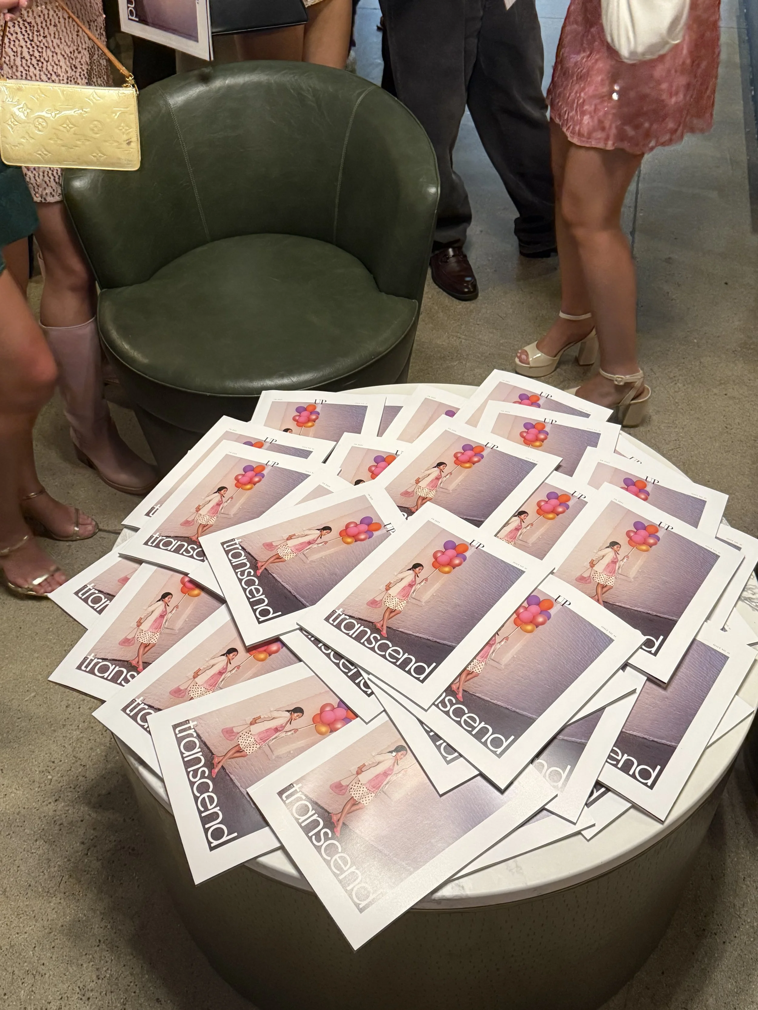
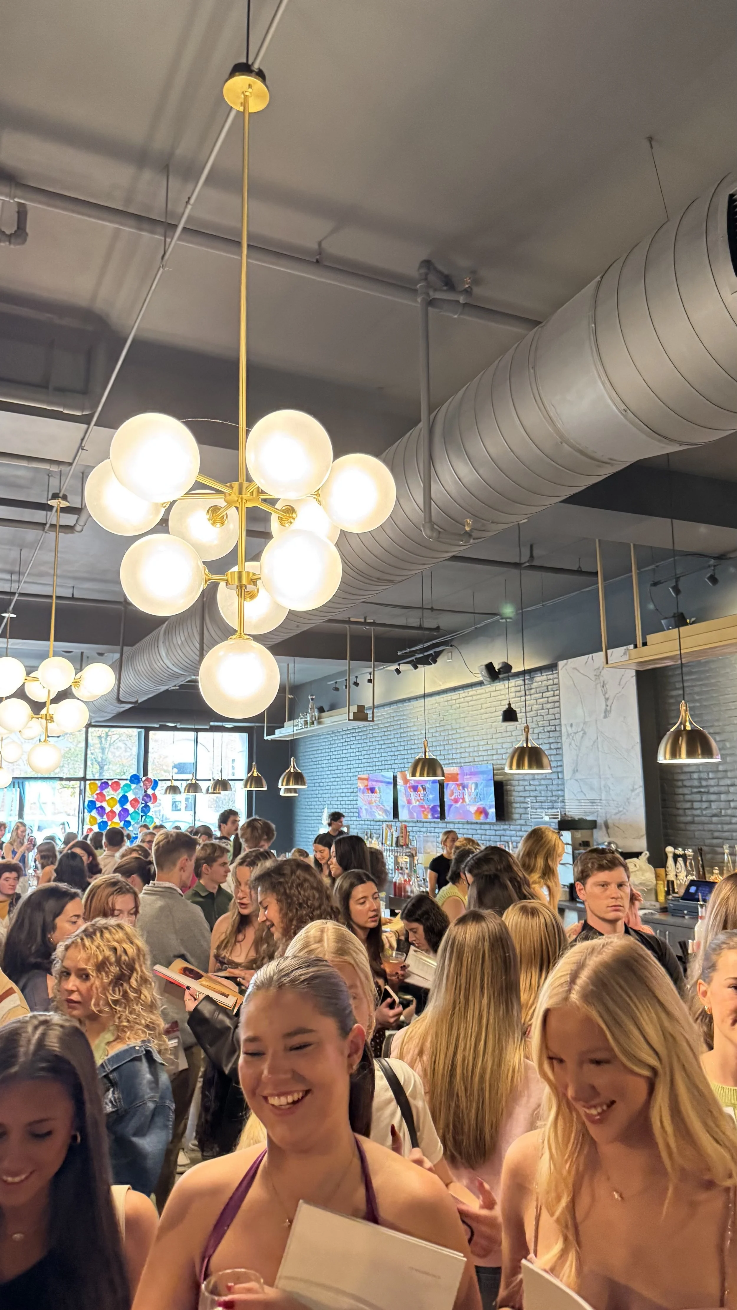
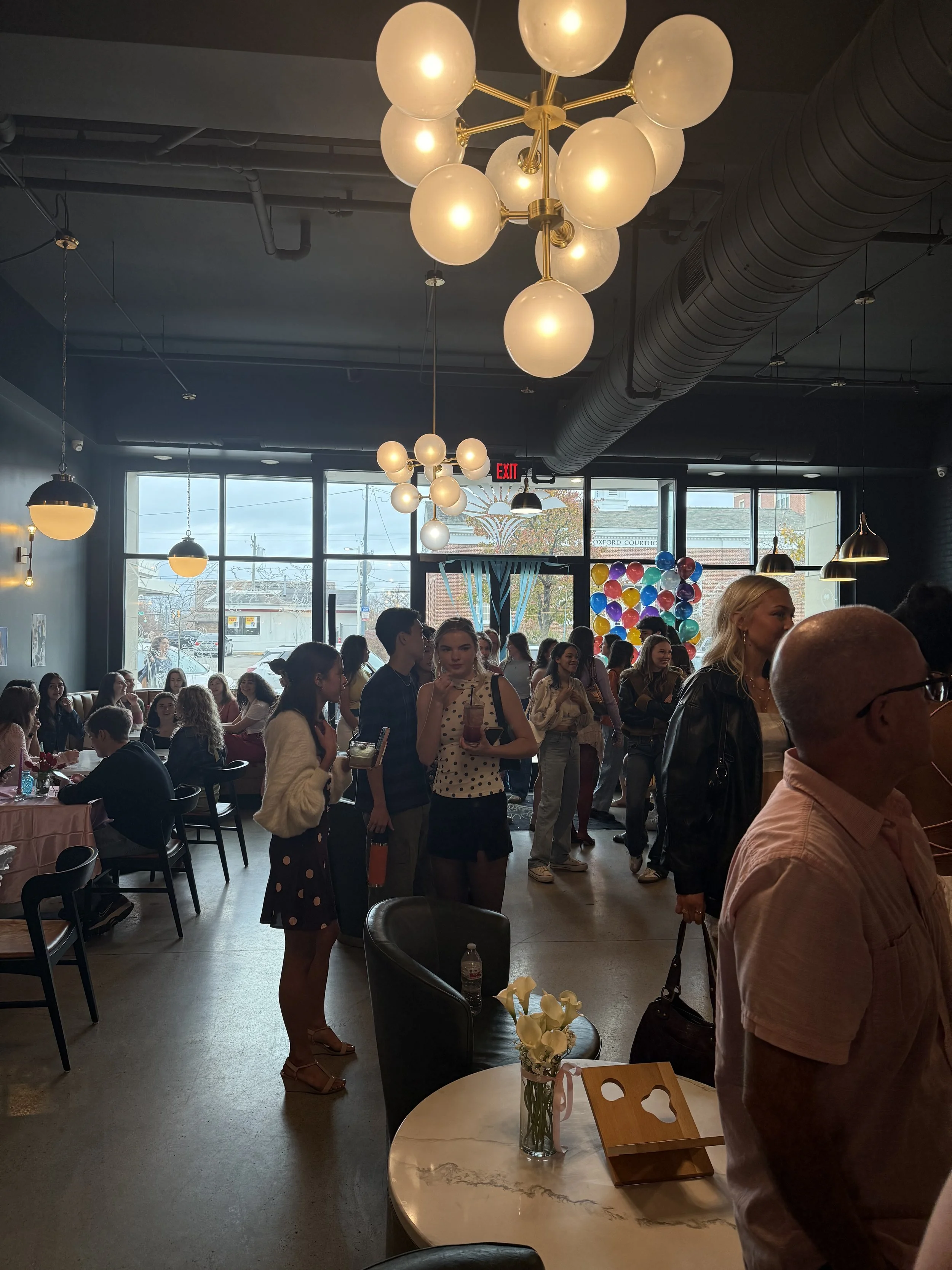
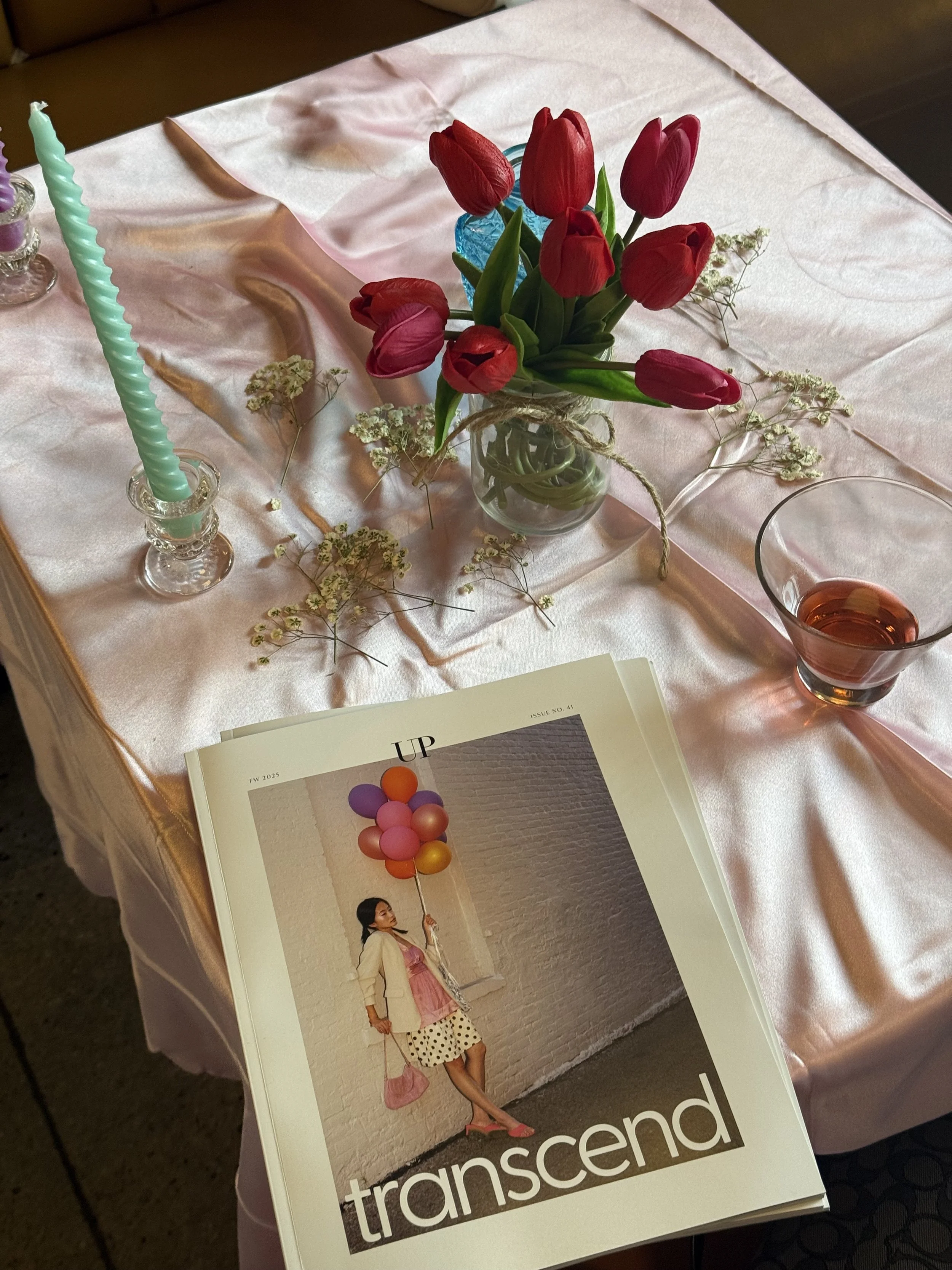
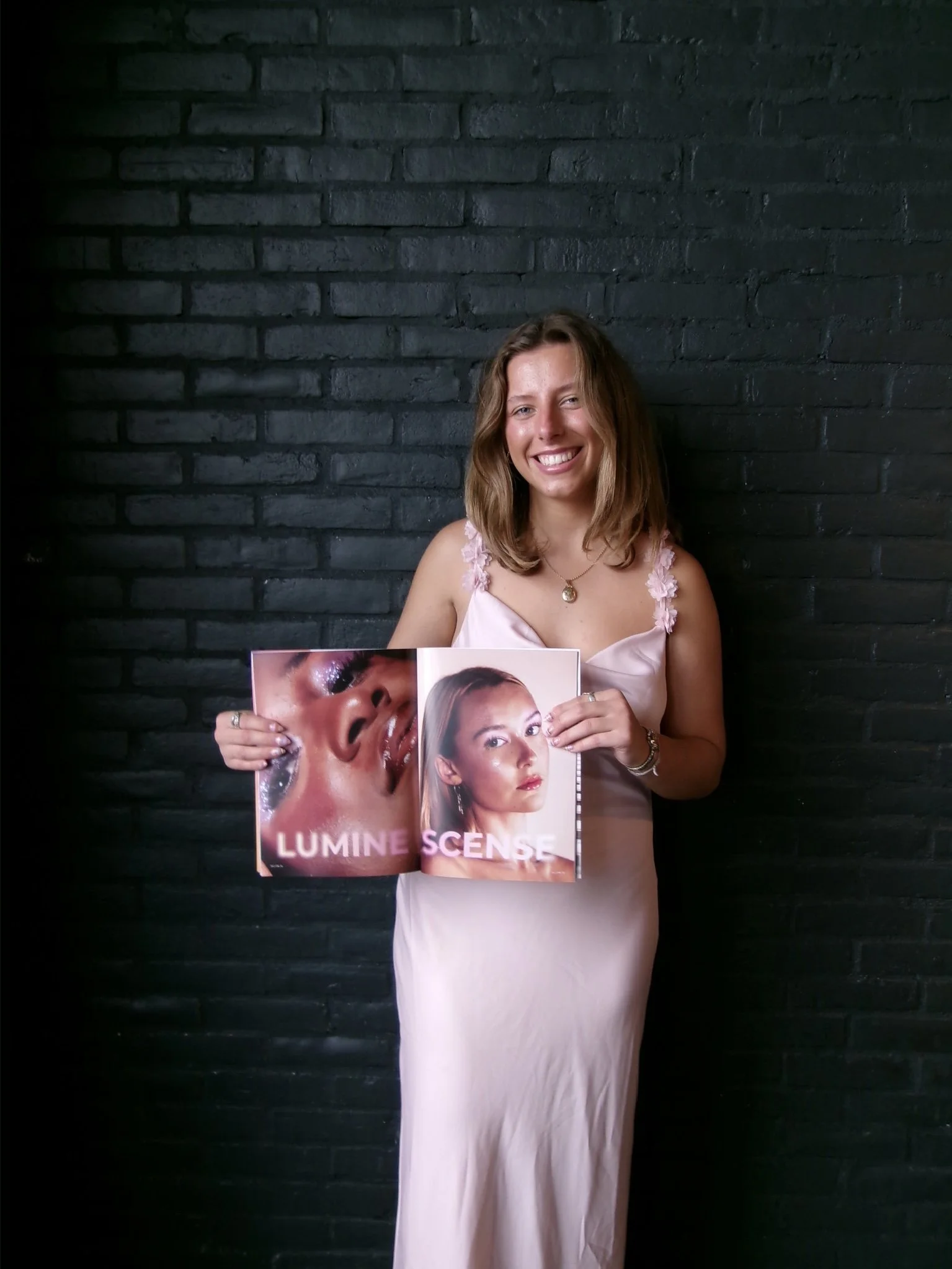
Release Party
Here is a collection of captured moments from the release party, highlighting the energy, excitement, and the fun of celebrating this project with everyone involved.