Project Overview
For this project, I redesigned the logo for the Miami Motorsports Club, a community of students who share a passion for cars and motorsports. The goal was to create a mark that feels bold, energetic, and reflective of the club’s spirit, while giving them a refreshed identity that brings members together under a unified visual brand.
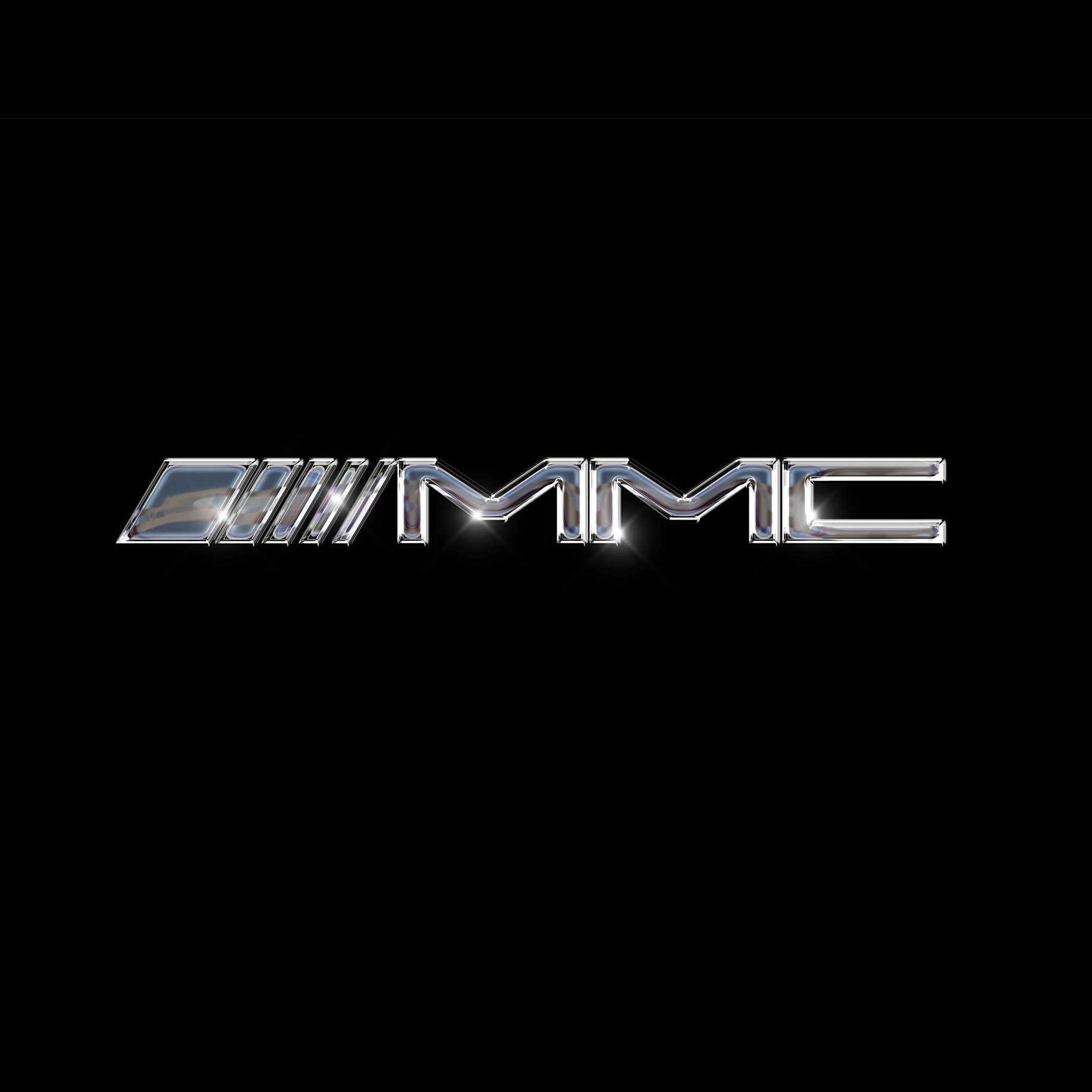
Logo
I created two logo variations to give the Miami Motorsports Club flexibility across different uses. The primary logo is a chromed logotype inspired by car badges, designed to feel bold, sleek, and connected to automotive culture. To complement it, I also created a circular logo mark for Instagram and other applications where a compact, emblem-style design works best. Together, these logos provide a cohesive identity that adapts to both digital and print needs.

TRACK DAY POSTERS
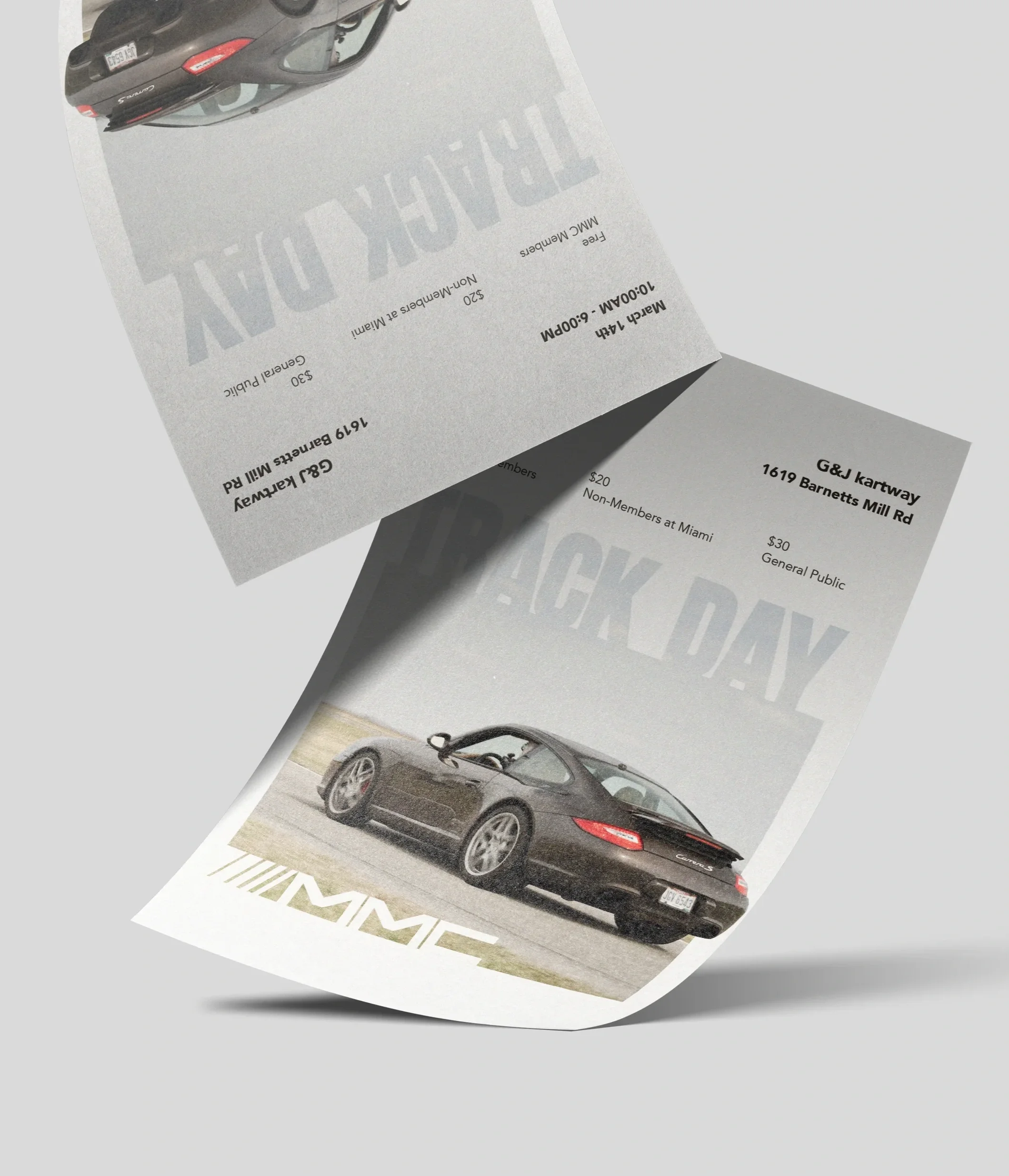
For the club’s semesterly track day posters, I worked with the social media director to gather event photos and all essential details such as location, pricing, and participation requirements. From there, I designed clear, energetic layouts that highlight the of each event while keeping the information easy to read and visually engaging.
Spring 24’ Poster
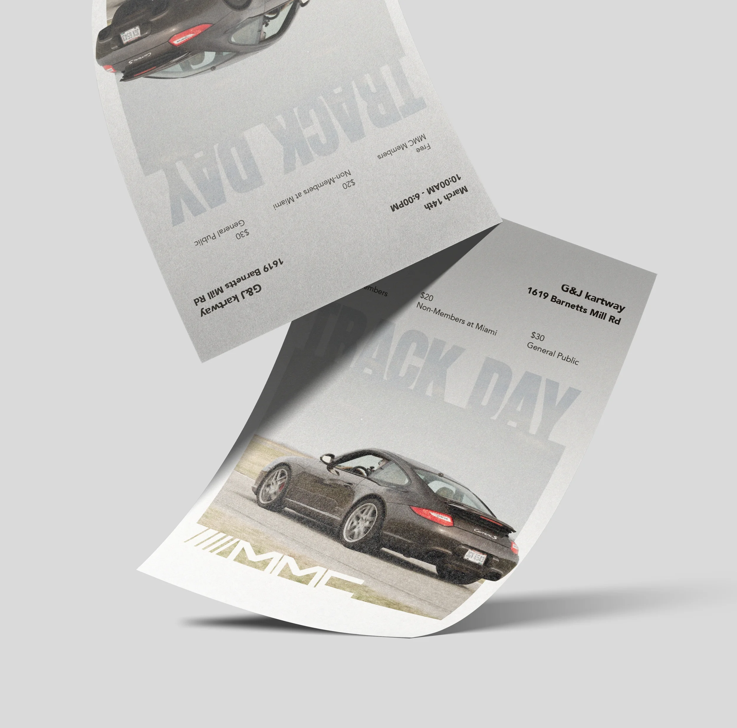
For the Spring 2025 track day poster, I wanted the design to feel fast, energetic, and reflective of the track day experience. I focused on creating a scattered type effect that brings a sense of motion into the layout, pairing it with a clean sans-serif font to keep the overall design modern and readable.
I also experimented with blur and movement effects to emphasize the energy of the event and highlight the car at the center of the layout. These visual elements helped reinforce the feeling of speed while keeping the composition clear and balanced.
Bringing everything together allowed the poster to feel dynamic without becoming overwhelming. The final design combines bold typography, expressive motion effects, and a clean layout to capture the excitement of track day in a visually engaging way.
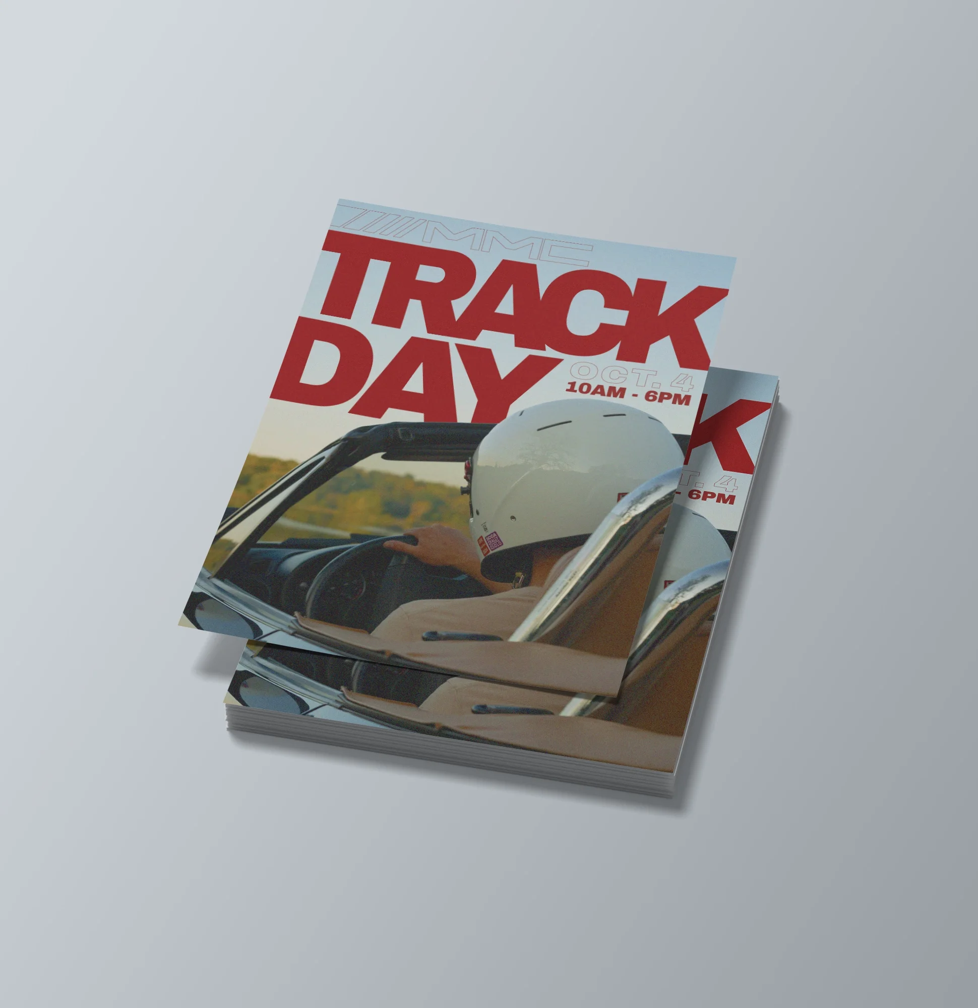
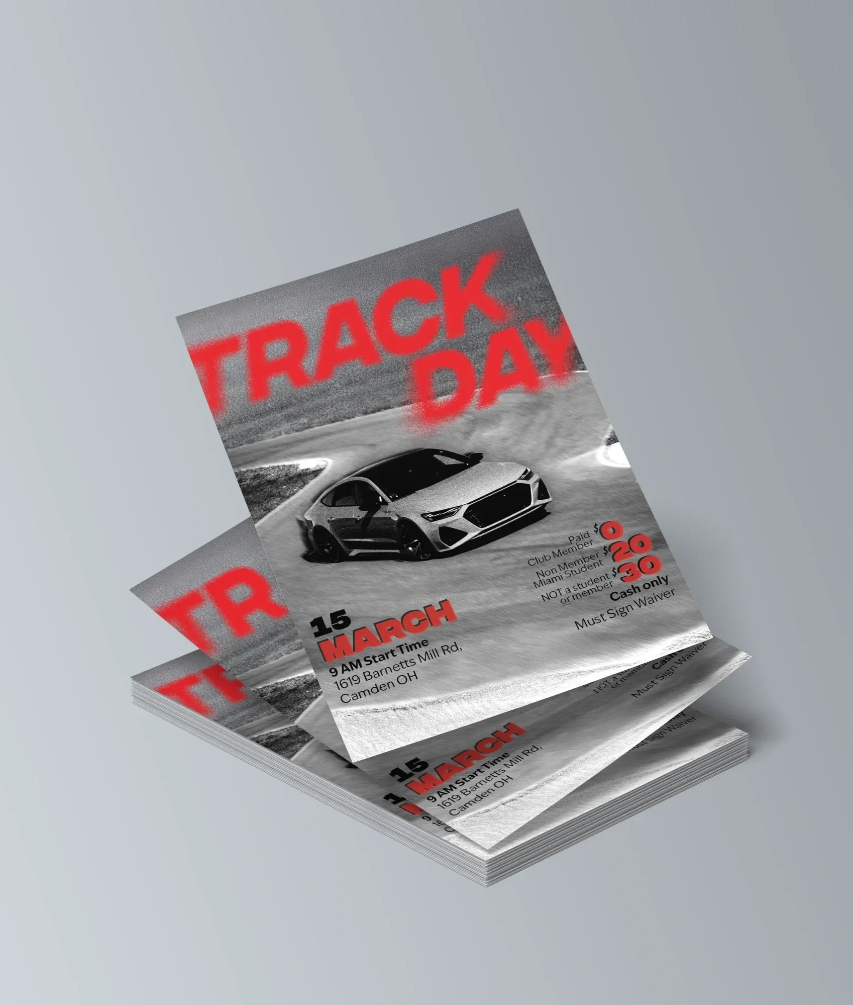
Fall 25’ POSTER
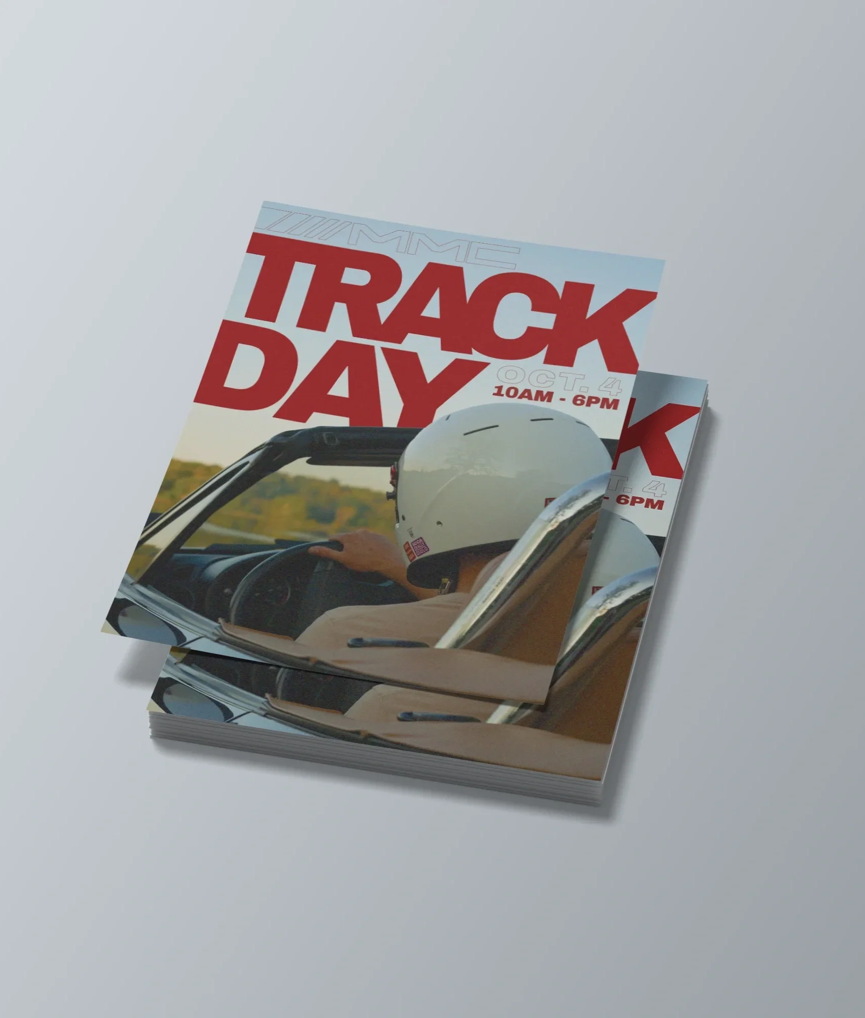
went out and shot new photos specifically for this design. The goal was to capture a behind-the-wheel perspective that feels immersive, giving the viewer a sense of being in the driver’s seat and connected to the energy of the track.
For the typography, I kept a clean sans serif look but experimented with outlining and full-color type to create contrast and visual rhythm. I also spent time playing with color and overall aesthetic tone, using the palette to enhance the mood of the photo and reinforce the feeling of speed and focus.
Together, these decisions helped the poster feel bold, immersive, and visually cohesive, highlighting both the intensity of track day and the style of the club.
Spring 26’ Poster
For the Spring 2025 track day poster, I wanted the design to feel fast, energetic, and reflective of the track day experience. I focused on creating a scattered type effect that brings a sense of motion into the layout, pairing it with a clean sans serif font to keep the overall design modern and readable.
I also experimented with blur and movement effects to emphasize the energy of the event and highlight the car at the center of the layout. These visual elements helped reinforce the feeling of speed while keeping the composition clear and balanced.
Bringing everything together allowed the poster to feel dynamic without becoming overwhelming. The final design combines bold typography, expressive motion effects, and a clean layout to capture the excitement of track day in a visually engaging way.
Shirt Designs
2024 school year
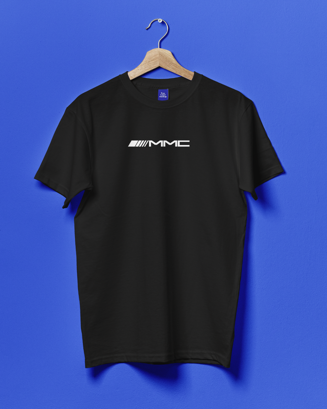
Front
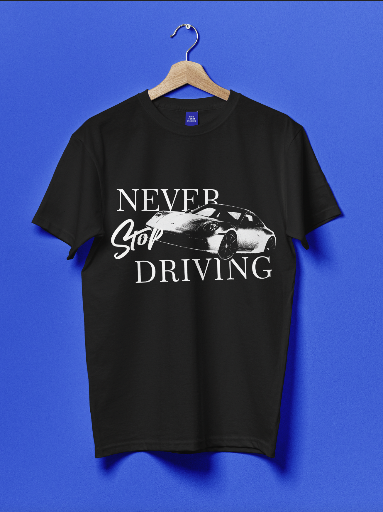
Back


For this part of the project, I created a shirt design for the 2024–2025 school year that is simple, clean, and wearable. I used a black and white color scheme with subtle textile textures to add depth while keeping the overall design minimal. The front features a pocket-sized version of the club logo, and the back includes their slogan, "Never Stop Driving," to tie the design directly to the club’s identity. The goal was to create a shirt that feels modern and graphic while remaining versatile and easy to wear.
Final pieces